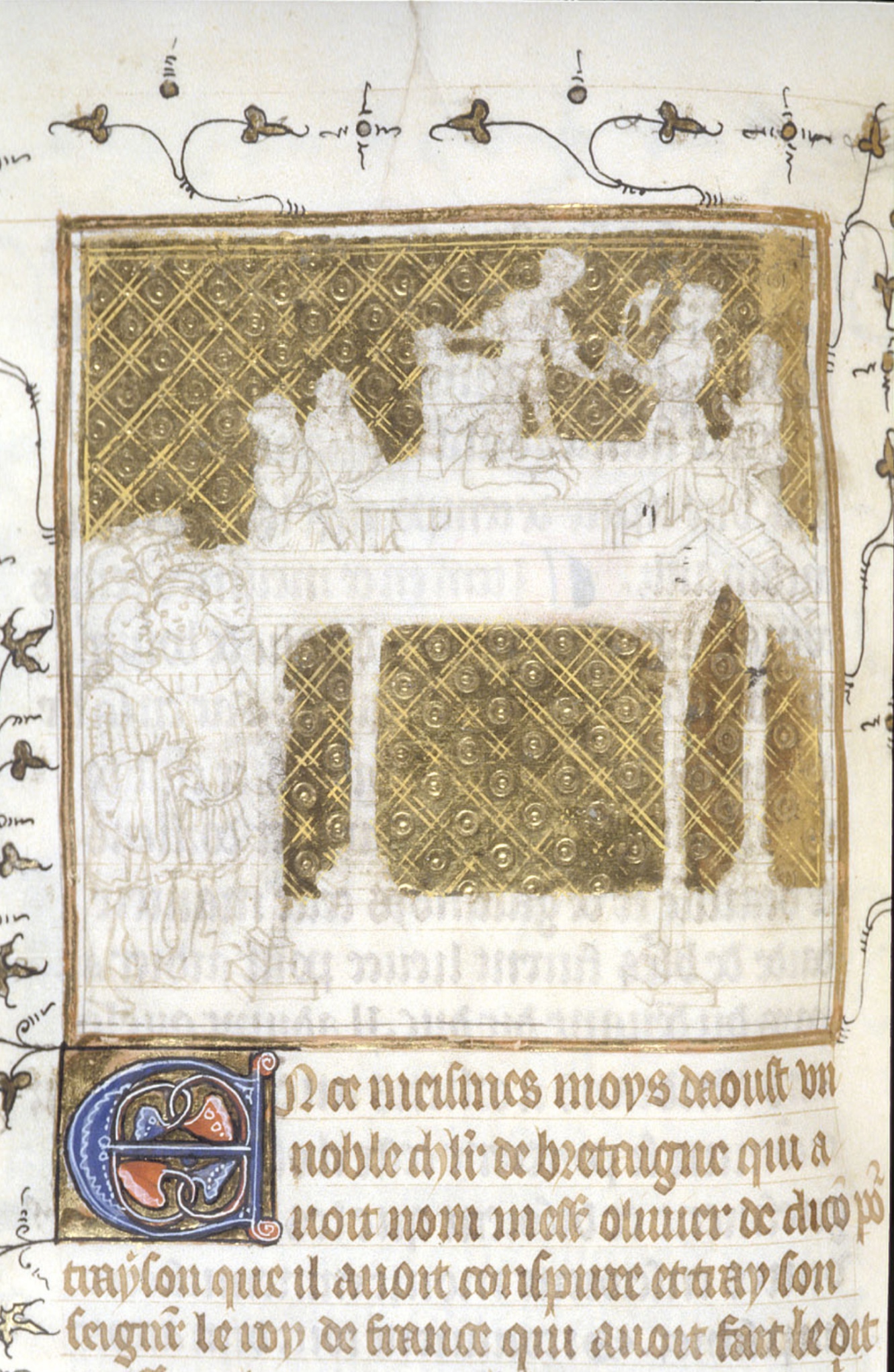
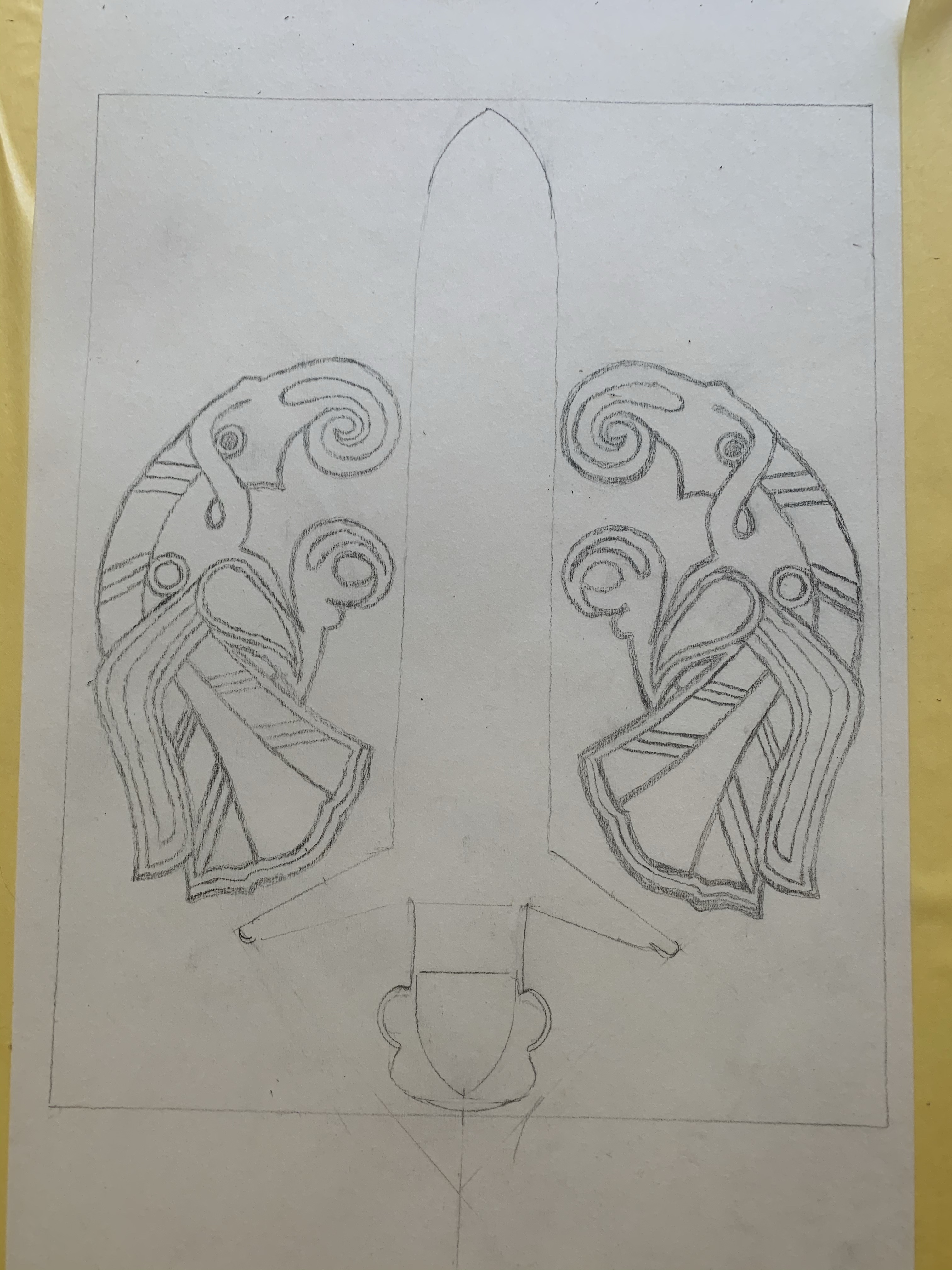
The finished scroll is fun to present and show off, it can be flashy and admired, but it doesn’t really exemplify all of the work that is put in to the creation. It also doesn’t show the “ugly” phases. Most beginning scribes get part way through a scroll and begin to think, “This will NEVER be lovely or look anything like the exemplar!” and want to give up. But we do have quite a few unfinished exemplars that show us just how “ugly” an illumination is before it becomes the final text.
I’d like to show some of those as well as a few of mine. Scribes, I feel, don’t often pull back the curtain to reveal their work in progress. I want it to be an encouragement to others, that a scroll HAS TO BE “UGLY” before it is done. It is how the illumination grows, layer by layer.
The glory of these pages is that they show us not only the ugly bits, but also “How They Were Done”. Images were sketched out, gold was applied, base colors, then details, then highlights. These are so very helpful in figuring out any exemplar that one wishes to use!
Progression of the Coral BranchHeavy on the gold…Flowers, a cat-astrophy, and correction (special thinks to Finnegan for spilling my paint water)Concept to end
I do confess that showing progression is a bit intimidating as your work is laid bare for perusal. But if it helps even one person to say, “Pfft, I can do that!” or “Hmm, that doesn’t look so hard!”, then it is totally worth being under the microscope!
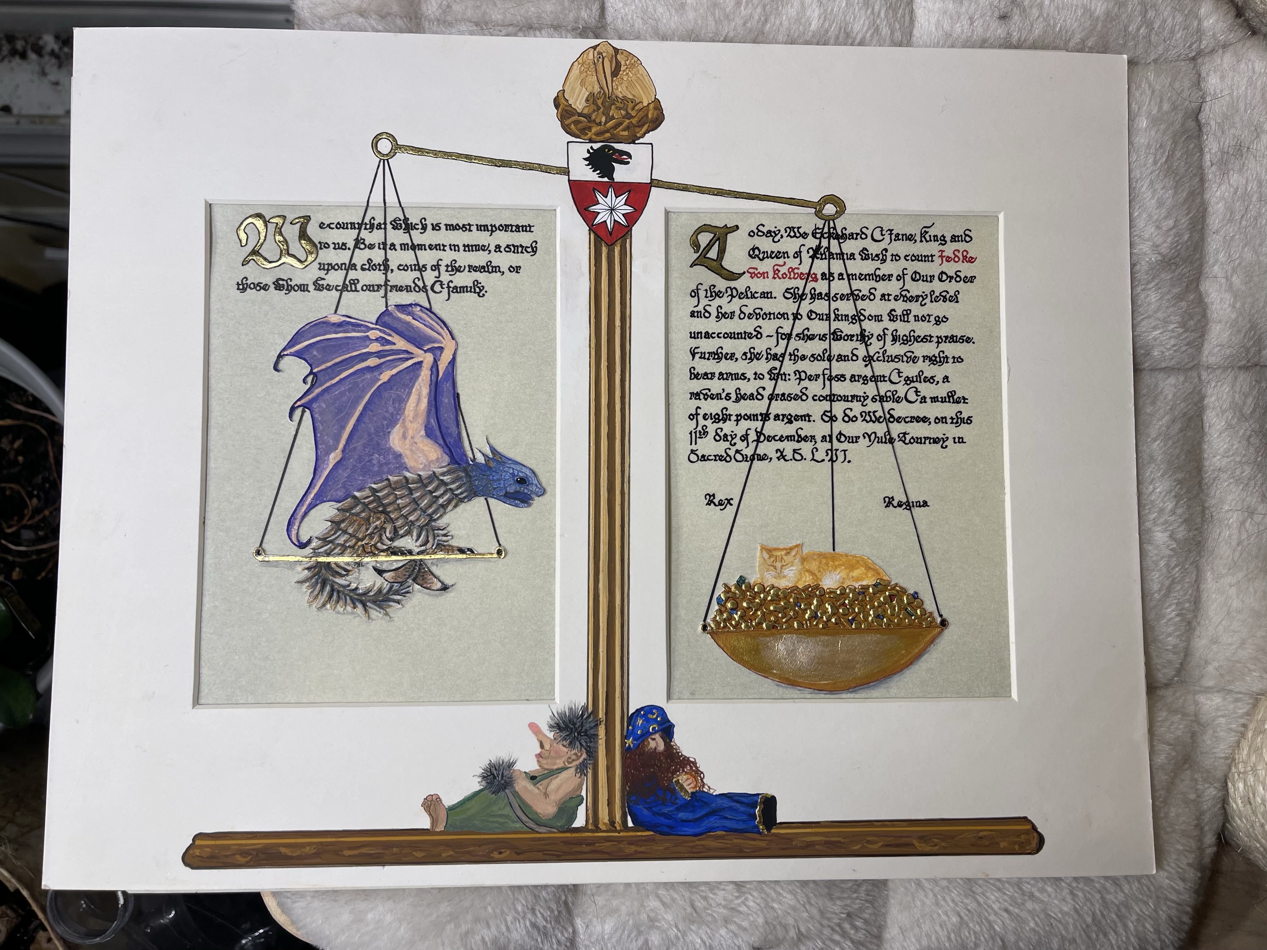
This award scroll was requested for a protégé and friend by her mentor. I was honored to be asked to do this for her. I also had a very close inside source to help with personalizing her scroll!
The recipient had held the position of exchequer at many levels from local all the way up to kingdom – she was the main “money counter”. Her persona is German, and her mentor snuck me photographs of some,of her collectibles, especially adorable troll, dragon and wizard figurines. She also requested inclusion of a beloved cat who had passed on but will always be a large piece of the recipient’s heart.
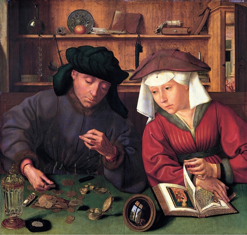
What would befit such a wonderful person? I thought of a painting by Quentin Matsys in 1514 called The Money Lender (or Changer) and His Wife. Most important in the painting for my purpose is the main tool of his trade, a scale.
Now to add realism…I had only two photographs of her kitty, and one was with him mostly facing away in profile. The other was a dark frontal view that required a bit of adjustment to get details…thank goodness for modern photo apps!
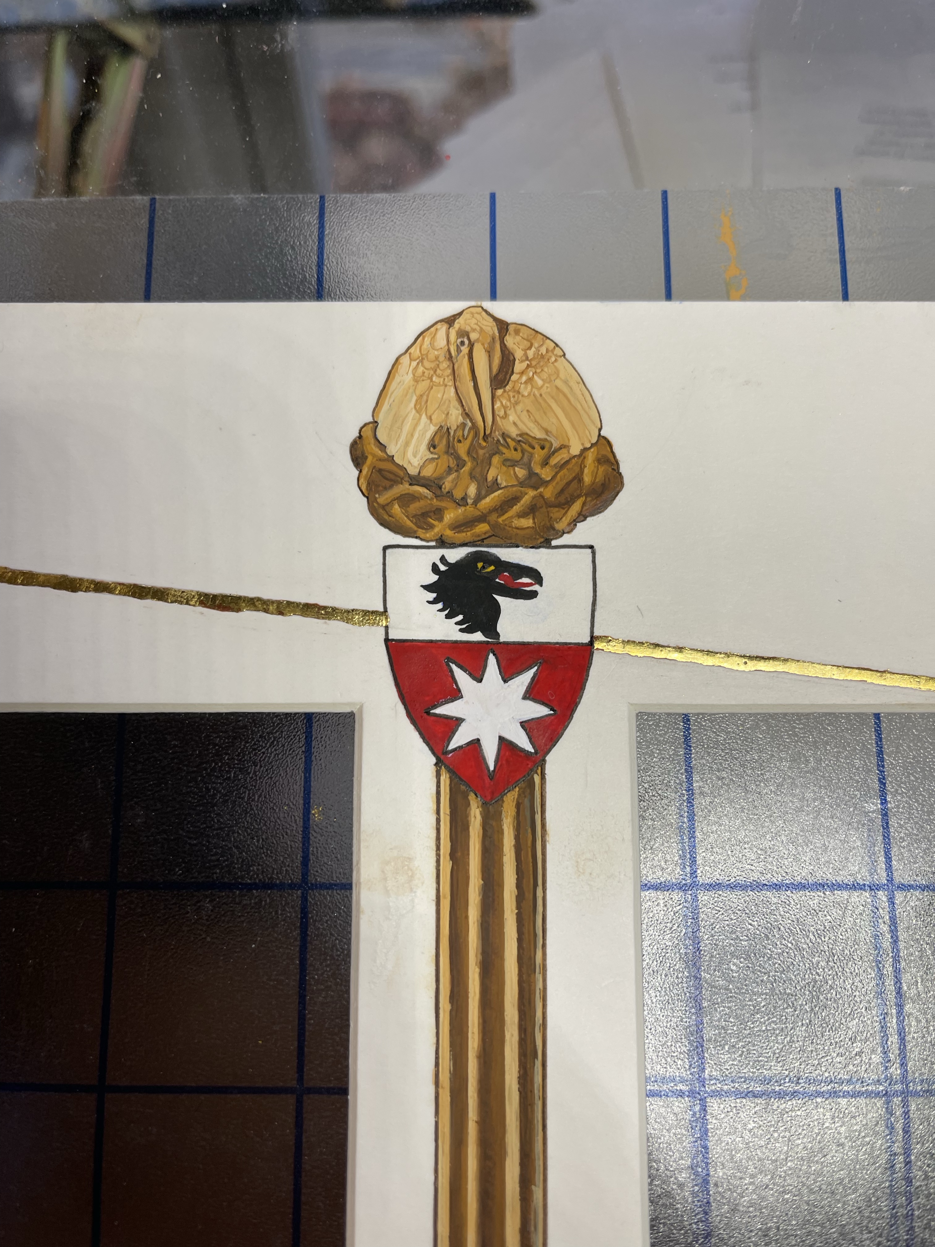
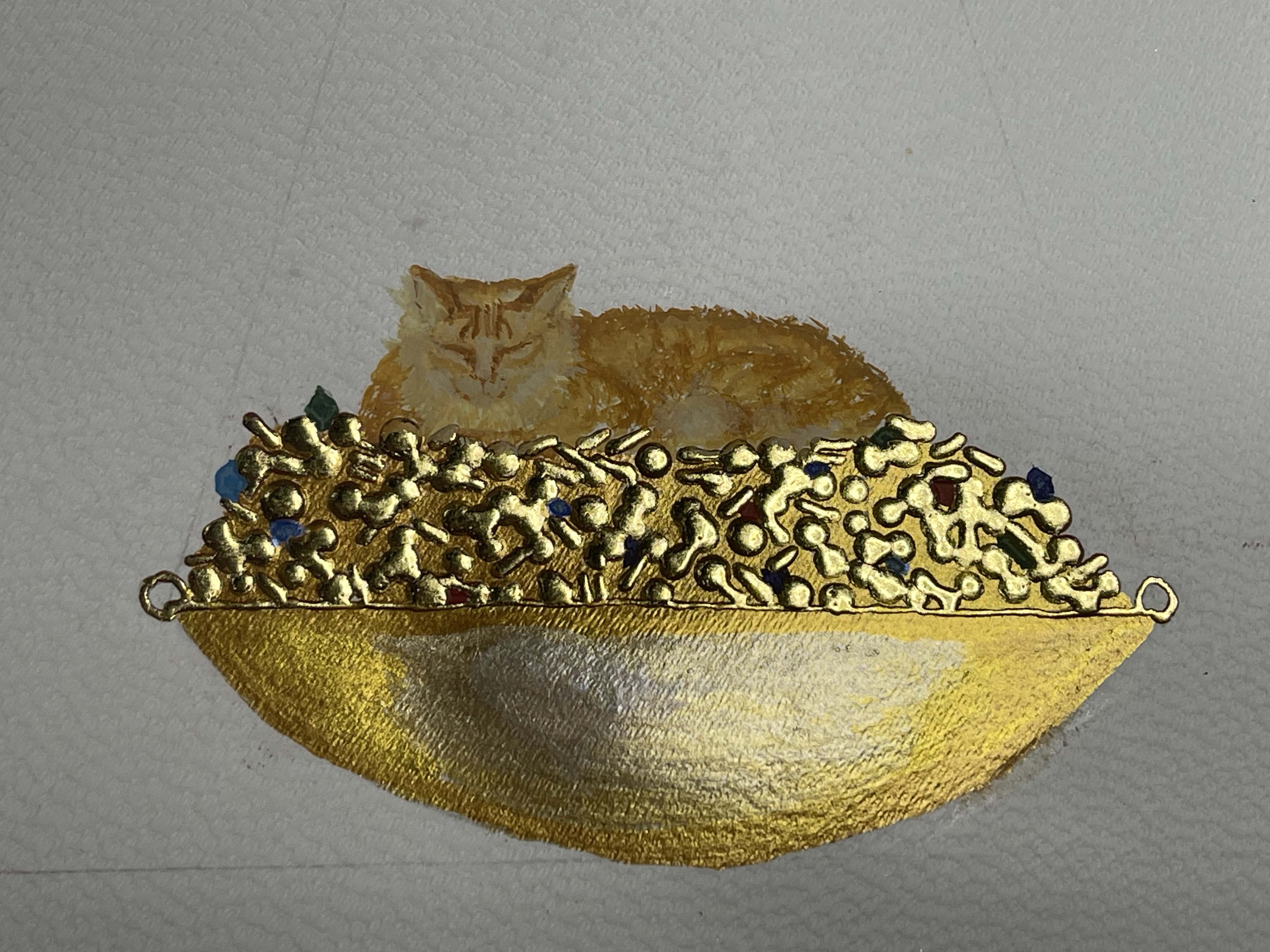
The idea of her cat, nestled smugly on a treasure of coin and jewels appealed, along with a very chagrined dragon looking on who SHOULD have that hoard! At the base of the scale her troll and wizard sleep, balanced and holding up the scale as a decoration. The beam is held in place by her heraldry, topped by a carved wooden Pelican in her Piety, the symbol of this award.
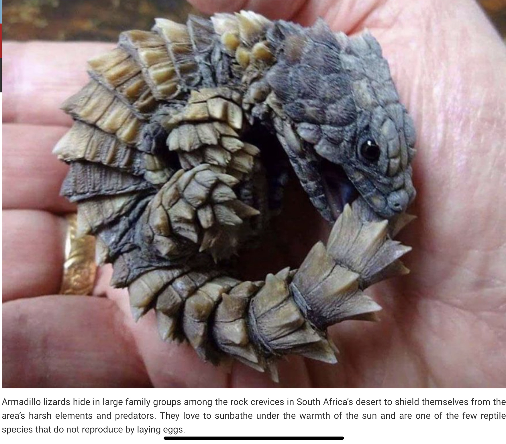
The dragon is cobbled from reality, using the wings of a bat and the body of an adorable lizard from Africa often called an Oroborous Lizard.
The batwinged lizard, aka dragon
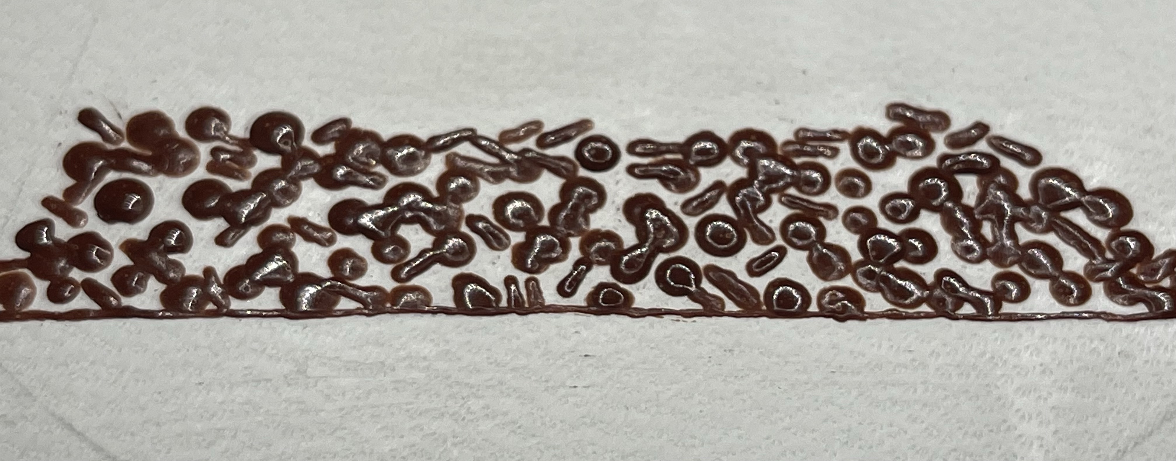
I wanted to make the pile of gold pop, and so created a fairly thicker gesso that would create depth with a 3-Dimensional perspective as the scroll was viewed. Gesso, once dried, will burnish, or polish, to an amazing mirror shine that, when gold leaf is applied dazzles the eye.
Gesso applied and on the left, the very start of burnishing.Burnished gesso in 3-D!Gold leaf applied, drawing the dragon’s envy.Process of gesso and gilding (Coliro golds fill in the background as well as the bowl of the dish. I wanted her kitty to be the center of attention, not the bowl.
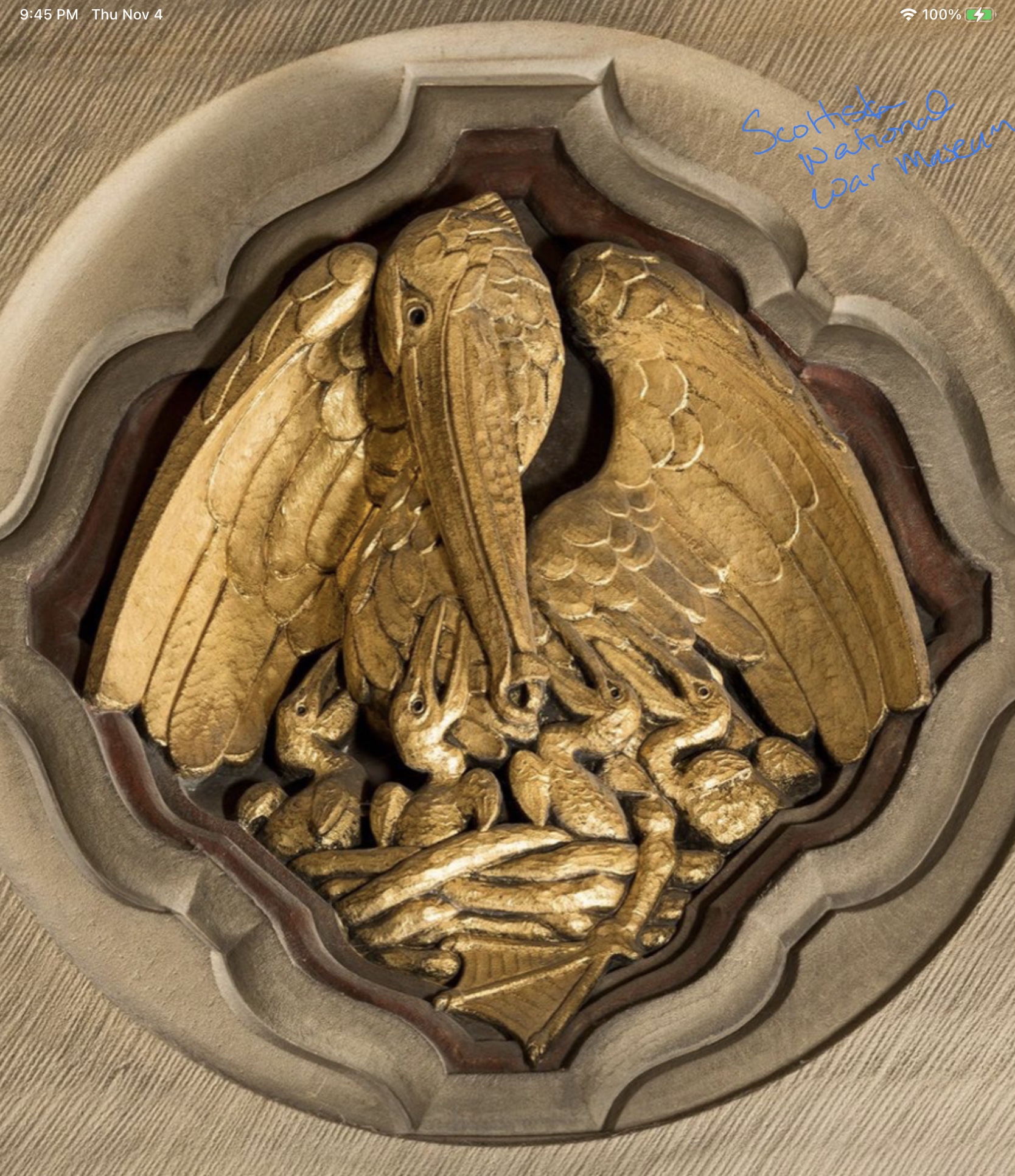
The Pelican in Her Piety was from a wood carving I had found online from the Scottish National War Museum. Unfortunately, that link no longer exists on their site so that is the extent of obtainable history. I wanted to recreate it as a wooden finial – no gold – atop the main bar of the scale, positioned above her heraldry.
Scottish National War Museum, Pelican in her PietyWooden finial Pelican
On the bottom, I place “decorations” on the scale – a troll and a wizard, modeled on the sneaky photos from her mentor of ones that were in the recipient’s home.
Troll figurinesWizard figurines Her figurines and a sleeping troll covered in his tail and a sleeping wizard, glowing magical spell in hand.
The background is pergamenata, the dragon and cat with gold are on parchment, cut out and applied to the pergamenata for layering. I used gouache for paint, with homemade gesso and gold leaf for the raised gold and the Coliro mica for flat fill. I also used the mat board to lend further dimension to the scale.
A backlog Baronage scroll: First iteration to the left, redo to the right.
Why are there two scrolls? I have the USPS to thank for allowing me a redo and a, IMO, vastly better second scroll.
It is not often that we do multiples of the same scroll, although it does occur (awards, largess, replacements, etc.). in this instance, I had finished the scroll, sent it to our Backlog Deputy and she had brought it, along with quite a few others, to her local post office. Time stretched and no word on delivery. Then she received this in the mail…
Waterlogged Scroll…
She was appalled, I was mad-sad at the USPS…and my brain stalled. This was my first effort at squashed bug, pearls and creating realism.
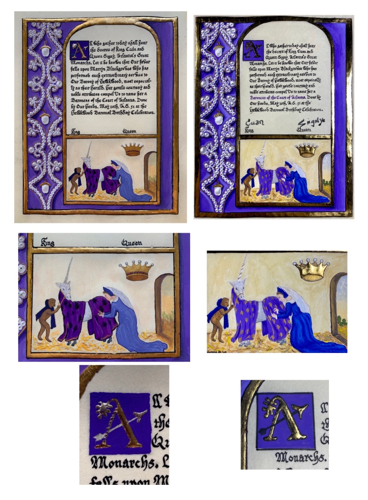
The scroll was a backlog, the recipient LOVES unicorns and purple. She is an archer and her heraldry contains oak leaves and acorns. I also had a photograph (courtesy of FB stalking) that showed her in a favorite dress. I had found a wonderful pair of exemplars to use as well.
War UnicornAdd MS 35313Add MS 35313Exemplars for this scroll
So it came together nicely! I used the side border of the Add MS, exemplar but in purple as that was her favorite color, and placed the War Unicorn below. I created an arrow through the primary initial, topping it with an oak leaf. On the unicorn’s blanket, I substituted oak leaves. A crown for her Baronage floated behind her like a divine image.
And then the postal soaking…now what?! Here was a scroll beyond any hope of redemption, and a lovely person still without their scroll. I so loved how I had fit her personal likes and persona bits into the scroll that it really was a no brained. She WOULD have her scroll, and she would have THIS scroll remade. Which I did. With improvements. Using lessons learned from the first. As I stated above it is not common to do a scroll more than once, and once completed, we often find ourselves picking apart our work. “If only I had done this or colored that differently”….so I took this as an opportunity for self improvement; a lesson to myself. How can I make this scroll better?
First, the pearls. They are, to my eye, much more realistic the second time around and seem to pop off of the page in full 3-D. My shading of the shadow box is bolder and less hesitant which adds to the realism/tromp l’œil. The primary initial is now raised gold leaf on gesso, more bold, more shiny. The blanket design now pops and her oak leaves are a focal point rather than a background thought, while the background of the picture is more vivid, and finally, the crown. It went from mica gold to raised gesso and gold leaf. It is HAPPENING! And again, a bolder set of colors and technique than the first…this scroll version is more confident and certain.
While I would never wish to have this happen again (all scrolls I mail are now in water-proof packaging and no longer via USPS), it was a learning opportunity and a progression along my scribal path to push myself to be better, to not let ill luck defeat me and to finally get a deserving recipient their award scroll.
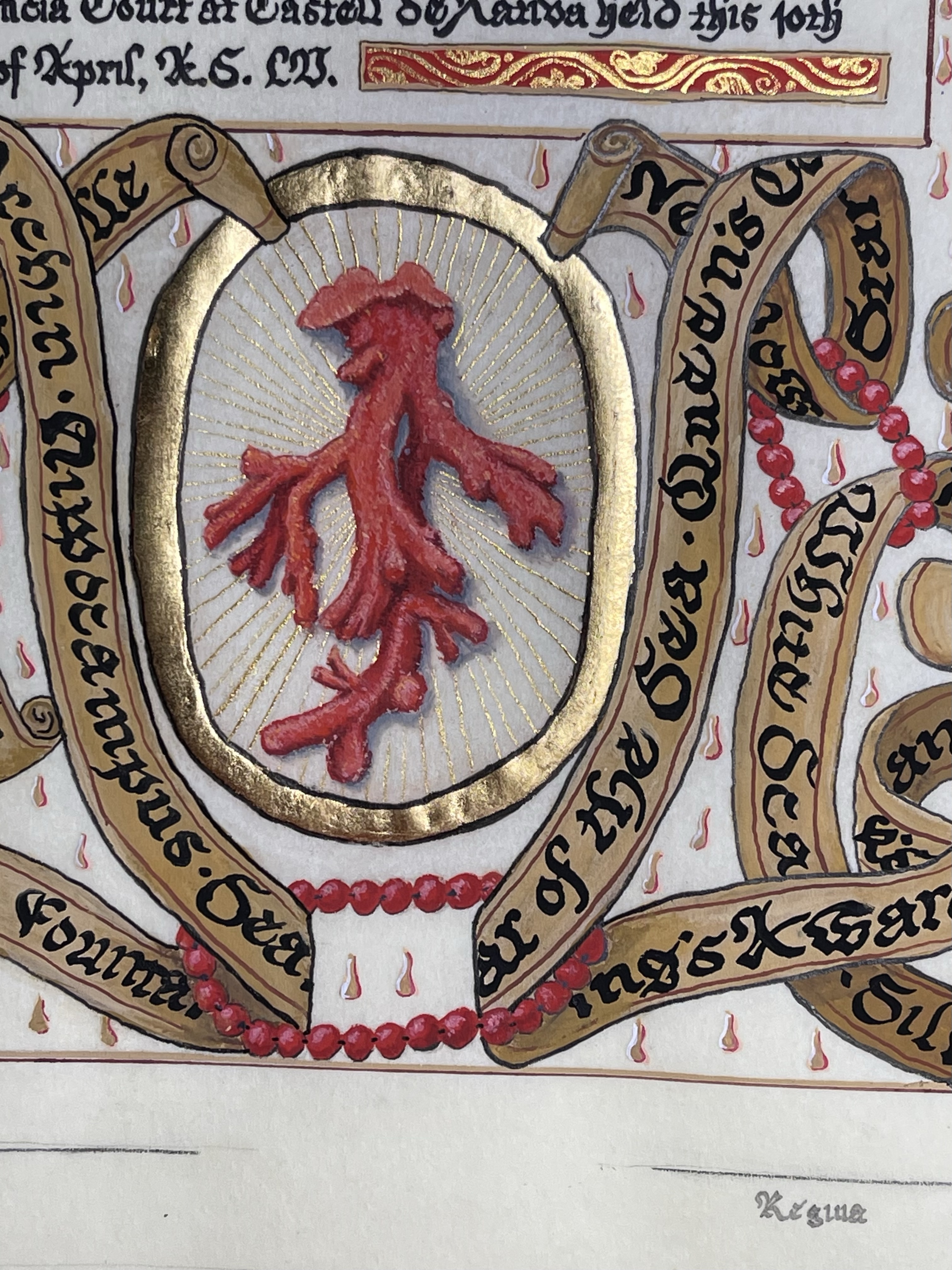
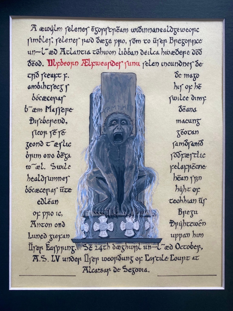
A Fountain written in Old English, for a Saxon Recipient
This was one of those scrolls that fairly created itself. The recipient has a Saxon persona and who, among many skills, is able to recite Beowulf entirely in Old English. He is a retired Marine, so I wanted a “strong” Fountain to better reflect hie mien.
The wording is in Old English, using multiple web sites (an OE dictionary and translation sites (such as this one) to check how the wording fit from OE to modern day English) to try and get a more accurate and proper translation. I knew some modern words would not translate, but did my best to make it flow and choose the correct wording so that hopefully, his reading would agree with my writing.
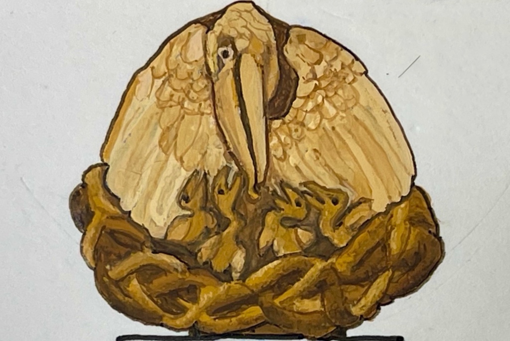
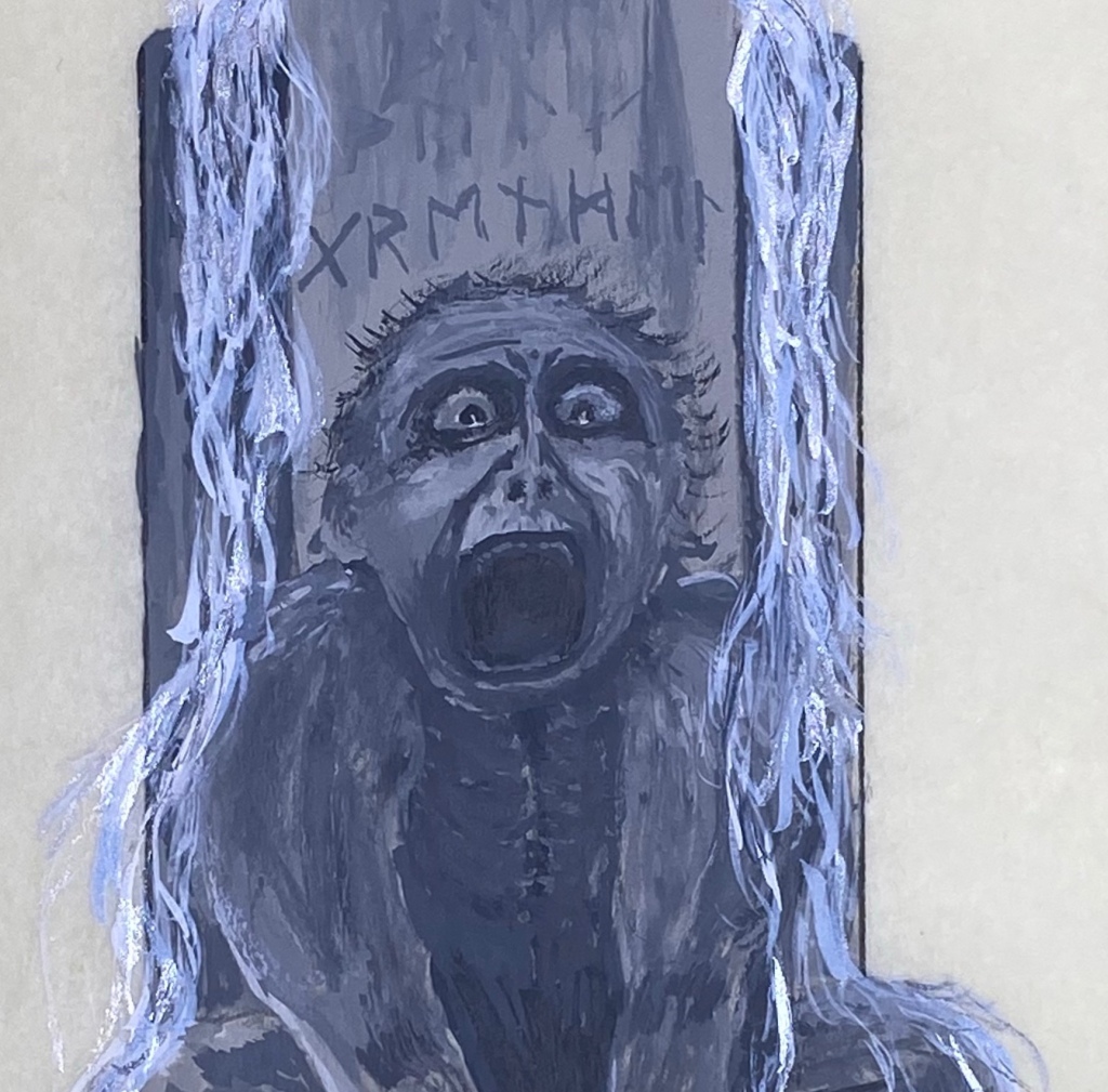
The figure is my take on Grendel from Beowulf, with my mental story of him terrorizing a village and then caught in a village’s fountain by a witch’s spell which turned him to stone. His face is based on an Italian gargoyle and the crosses at the bottom are based on a various Anglo-Saxon relics as well as the recipient’s tabard. The runes above his head are a transliteration of the word “Grendel”.
A bit out of our time, but the gargoyle’s expression was the perfect image I wanted to convey anguish and some horror at being turned to stone.
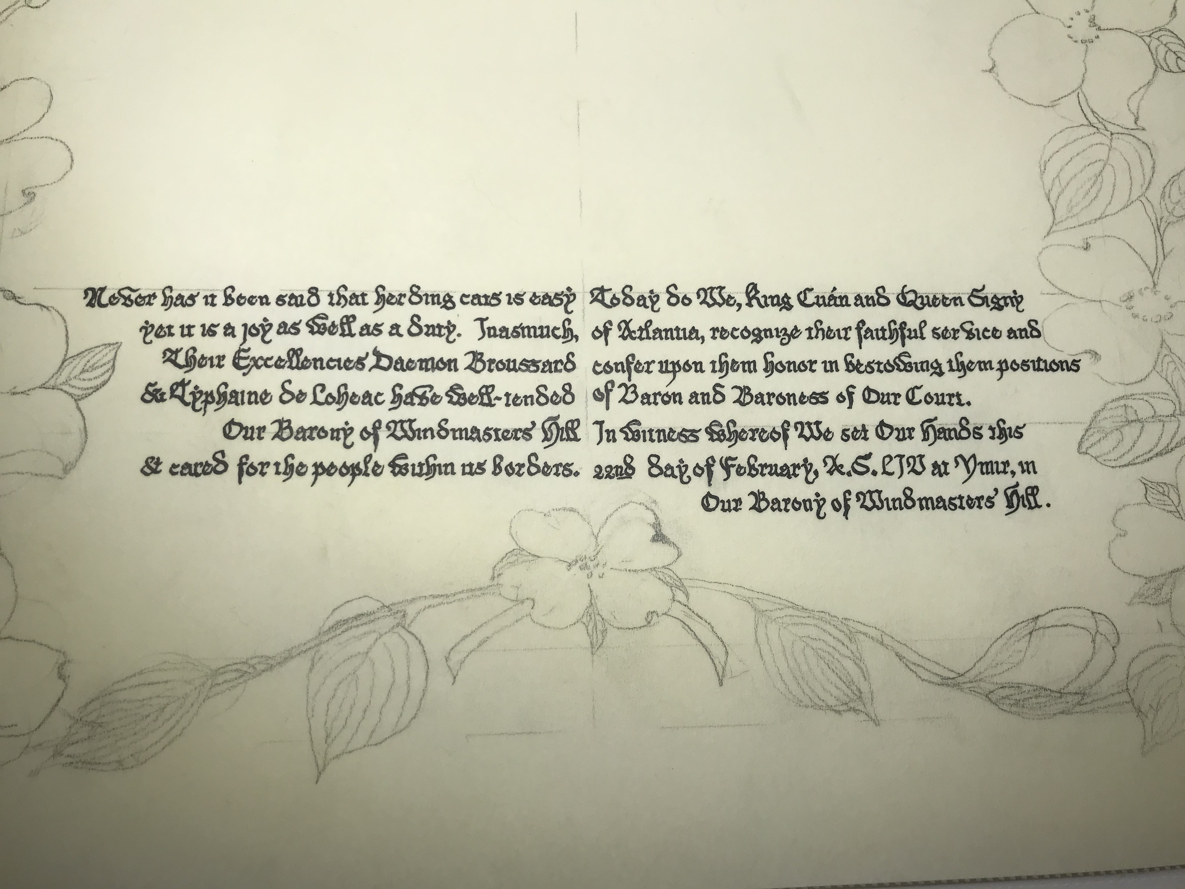
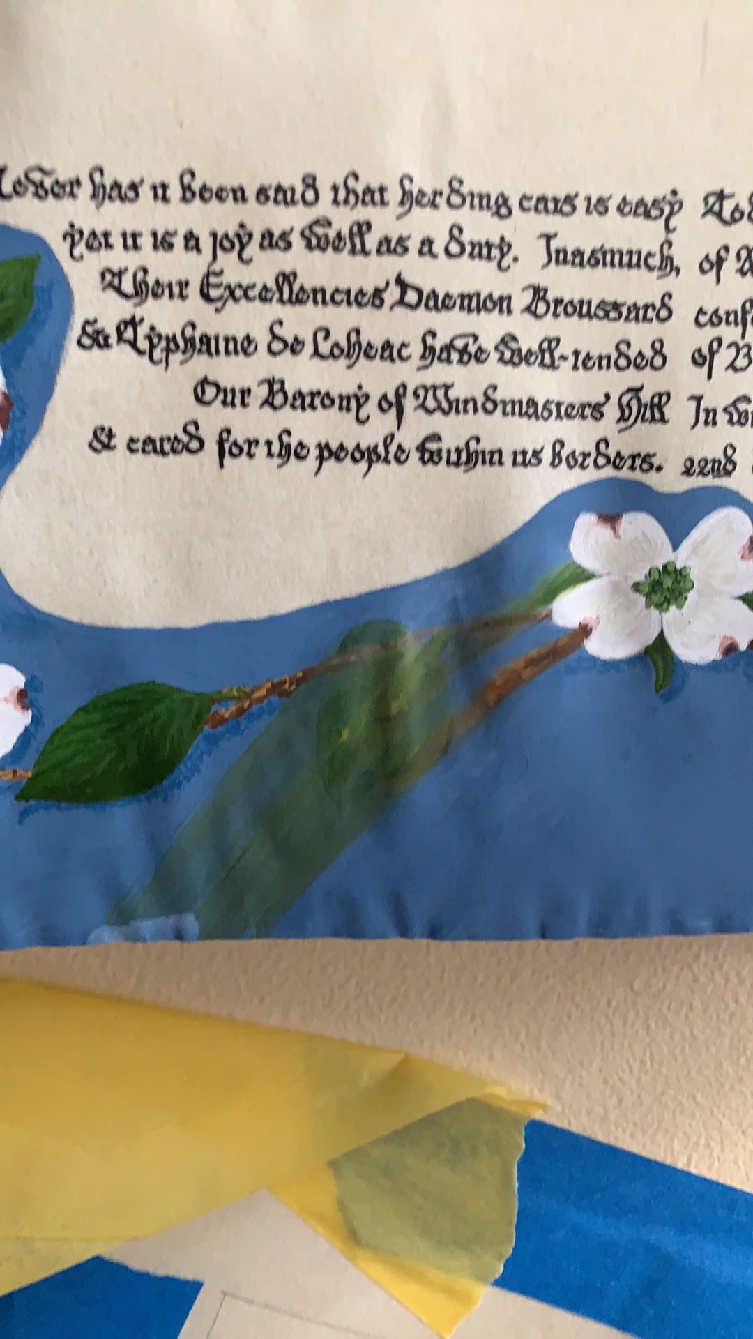
Translation: As a fountain sprays water into the world, giving of itself, there are those in Our Kingdom of Atlantia who do the same for the populace. Ulfbeorn Ælfweardes sunu exemplifies this giving nature. He has served his barony as both Exchequer and Seneschal, making sure that it flows as smoothly as water in a gentle river. His steadfast devotion to his barony without expectation of reward makes Us, King Anton and Queen Luned bestow upon him Our Fountain. Done this 24th day of October, A.S. LV at Our celebration of Castile Court at Alcazar de Segovia.
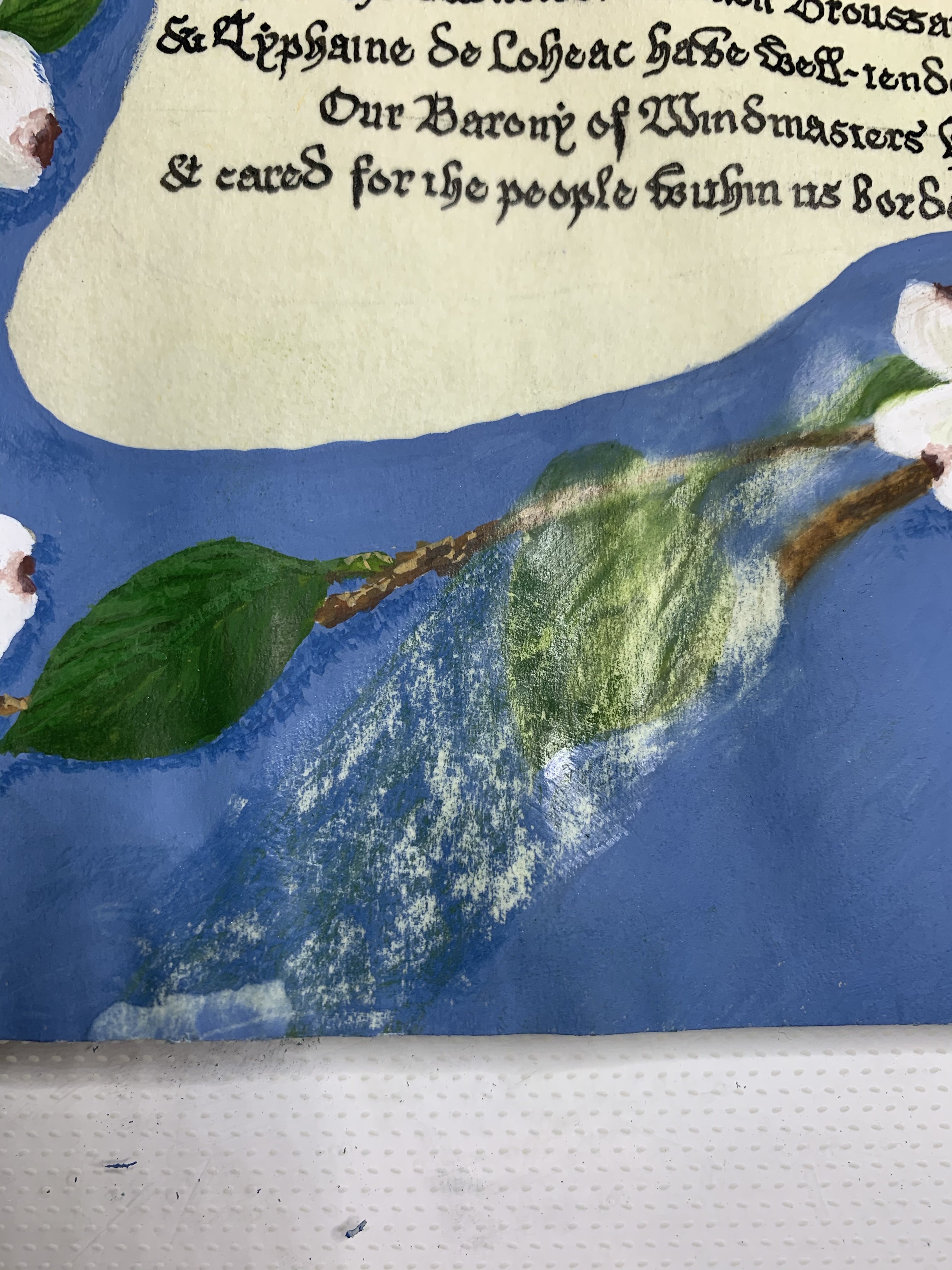
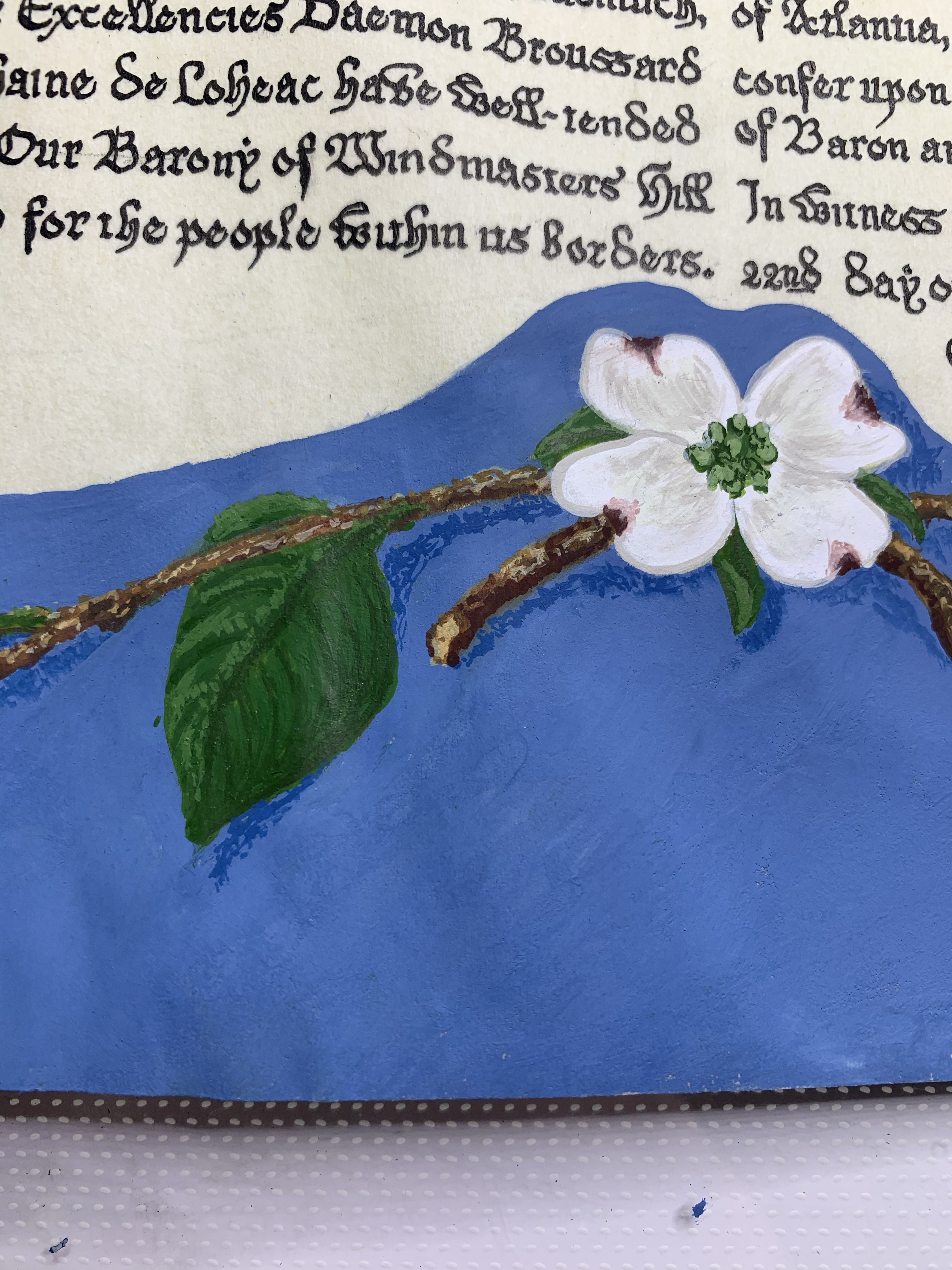
The scroll itself is gouache on pergamenata, using shading to convey the water falling as well as the texture of worn stone.
From gargoyle to terrified monster.Ensuring my calligraphy was period appropriate to the Saxon/Old English timeframe.