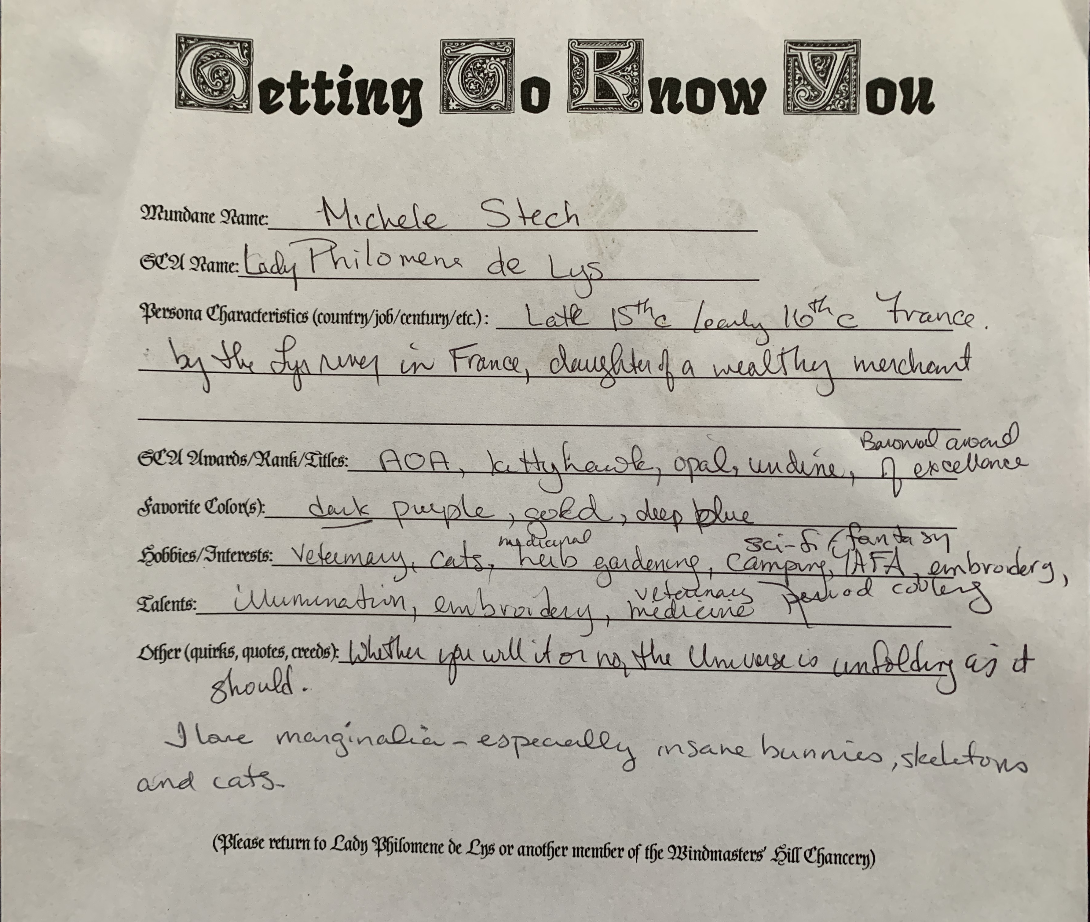
As I previously stated, I feel strongly about making the presented scroll pertinent and personalized to the recipient. For some people, this may be their only award ever, which is totally perfect if that is their wish, but if so, let’s make it the most awesome scroll for them! I thought about this quite a bit…and while I know some folks (and more as time passes), I don’t know everybody. Facebook stalking only gets you so far if you are not friends with that person or a friend of a friend. Other scribes have got to feel the angst in not knowing the person to whom you’re assigned, no? What to do?
I came up with a plan. I created a “Getting to Know You” form for the folks of our Barony…start local and hopefully move outward from there. If I can get folks into the Chancery database, then any scribe can have access to basic information. Yes, these would become dated as folks received awards, etc., but at least the basic things (favorite colors, name spelling, etc.) should remain fairly constant. Below is mine, filled out. I brought blanks to canton meetings and some events. My next goal is to put it into a google.doc and put it up on our Baronial page.
This award was for the son of a friend. This young man is amazingly helpful and always cheerful, and I am proud to call him a friend as well. His persona is Japanese, so truly outside my (admittedly limited) experience. I wanted to find something to strike a chord with him. I asked his mother for some help…favorite colors, persona, spelling of the name, as he hadn’t been officially registered with the SCA at that point, if I recall correctly. I found a Persian pen and ink drawing of a dragon that was just awesome and started there.
17th c. Persia, Safavid, ink on paper. I believe this was up for auction and I found it in Pinterest.
So, now what? I had a lovely dragon, but how to create the rest of the scroll? My Laurel-to-be suggested a wash like in traditional Japanese landscapes. I’ve never done ANY watercoloring, let alone a wash. Online videos helped. I used the blue color that the recipient favored and attempted the wash. The color graduation was quite nice. Pergamenata does NOT like water. It buckled and warped like a black hole despite being taped on all 4 sides. Looking back, less water would probably have worked just fine, although it may have been more lined and not blended.
After that, I wanted to keep the feel going with the dragon so I drew smoke from his nostrils, modeling it on the traditional flow of Japanese painting of air currents. I wrote the words within the smoke as emanating from the dragon. His award was the Eurus, named from the Greek god of the East Wind. Smoke/wind/words. All air currents.
Gouache on pergamenata, Micron ink with diluted Noodler’s eternal for shading on the dragon, stones and smoke.
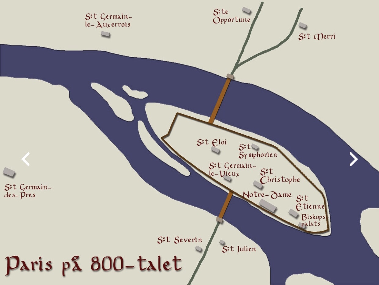
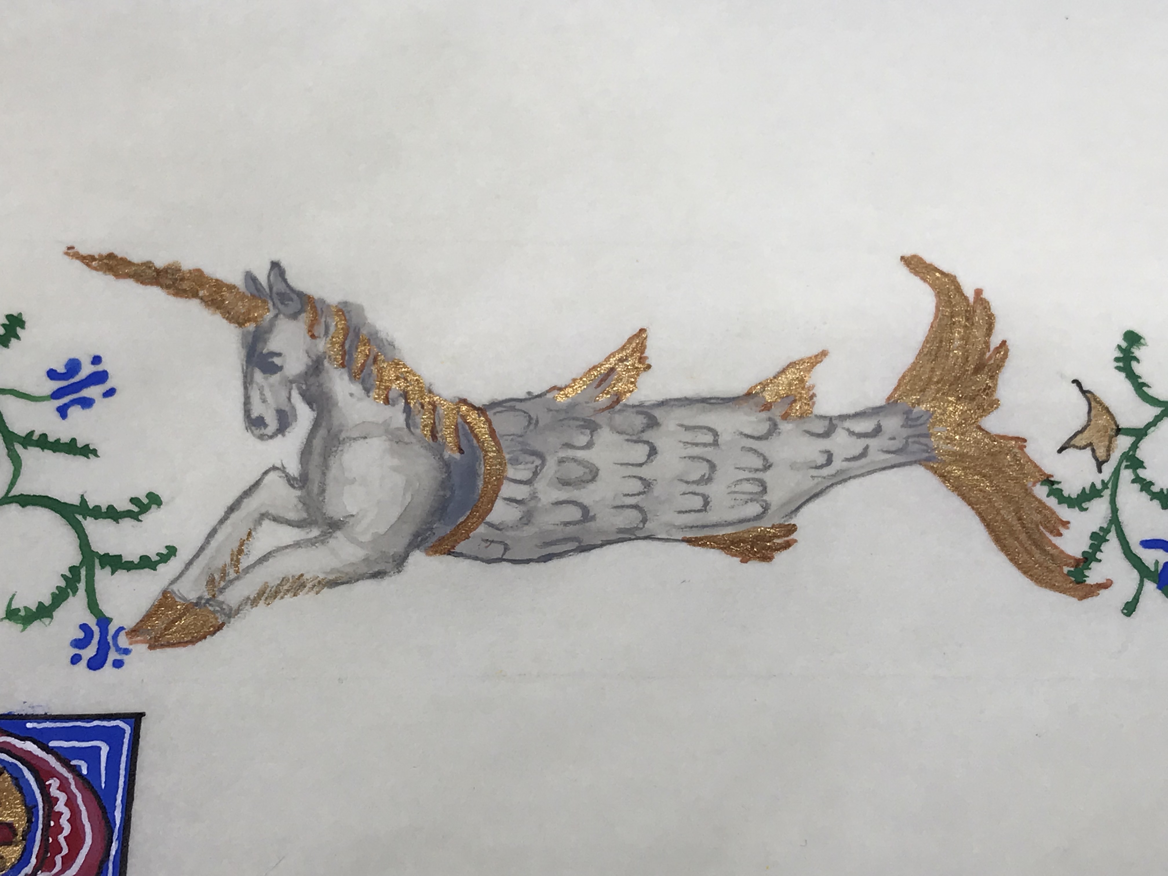
My Laurel (not officially so yet) was running the A&S competition at Ymir 43. This year’s battle was to be the Vikings’ siege on Paris. Just as the battle sides were divided, so too was the competition. The winner, by populous vote, would have produced either a Viking or French item. The award scroll had to represent either.
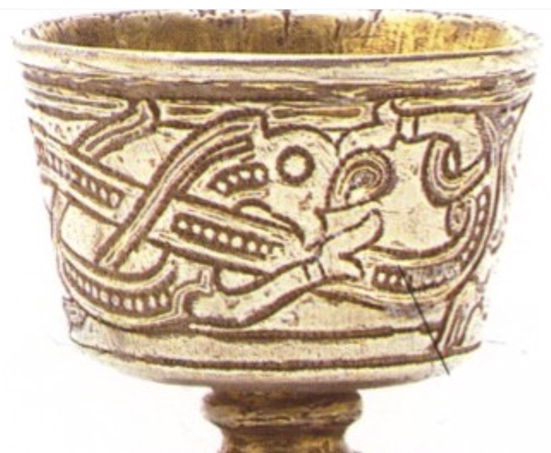
Looking for inspiration, I read up on the battles, and found a lovely map of 9th C. Paris (basically what is now Île de la Cité). Perfect and pertinent! Now, Viking….obviously not a ton of scrollwork from them, so I looked toward grave and hoard finds. There was a beautiful hammered cup from which I took the creature’s form and painted it, straightened out, onto the scroll. I considered going with gold or silver for its lines, but it would have made the map look rather drab and besides, my French persona would like to make a subtle (?) jab at the Viking invaders who dared blackmail my country, and I painted that creature in the colors of the French flag 🇫🇷 …Tiens (take that)!
The calligraphy is poor, hindsight making it seem more so. I believe that I did this before I had my “a-ha” moment with calligraphy and hands and the lettering is too large and difficult. The formation of them was a struggle…probably had my tongue stuck out in concentration and sweat beading my brow. I placed the award scroll in a small frame for presentation.
Gouache on pergamenata, Micron pen outline.
As an aside to the aside, we, at the Chancery, realized that there were a few things that needed to be adjusted. Some folks had never received their scrolls, and others were being awarded “impromptu” commendations by the nobility. We thought that a promissory scroll was just the thing. The receipient would have something physical to take home that day and it bought us time to be able to create something beautiful for them rather than use an off-the-rack blank. Not that some blanks aren’t beautiful, but we really didn’t have any of those either! Below is an example of the promissory scroll:
Noodler’s ink, braus nib on pergamenata. Fraktur hand. Obviously, the pencil lines would be erased!
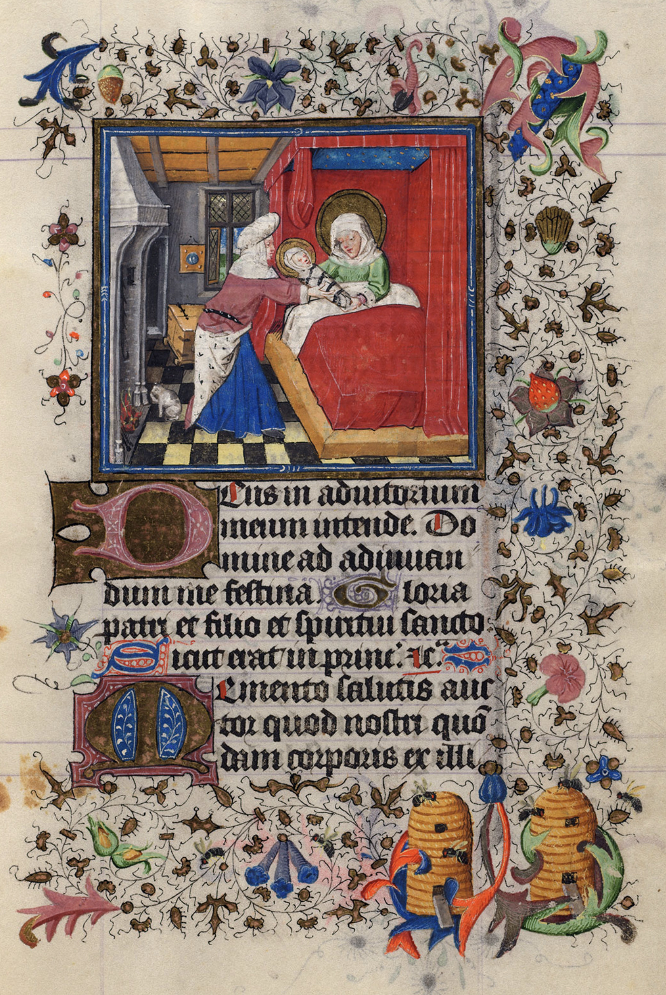
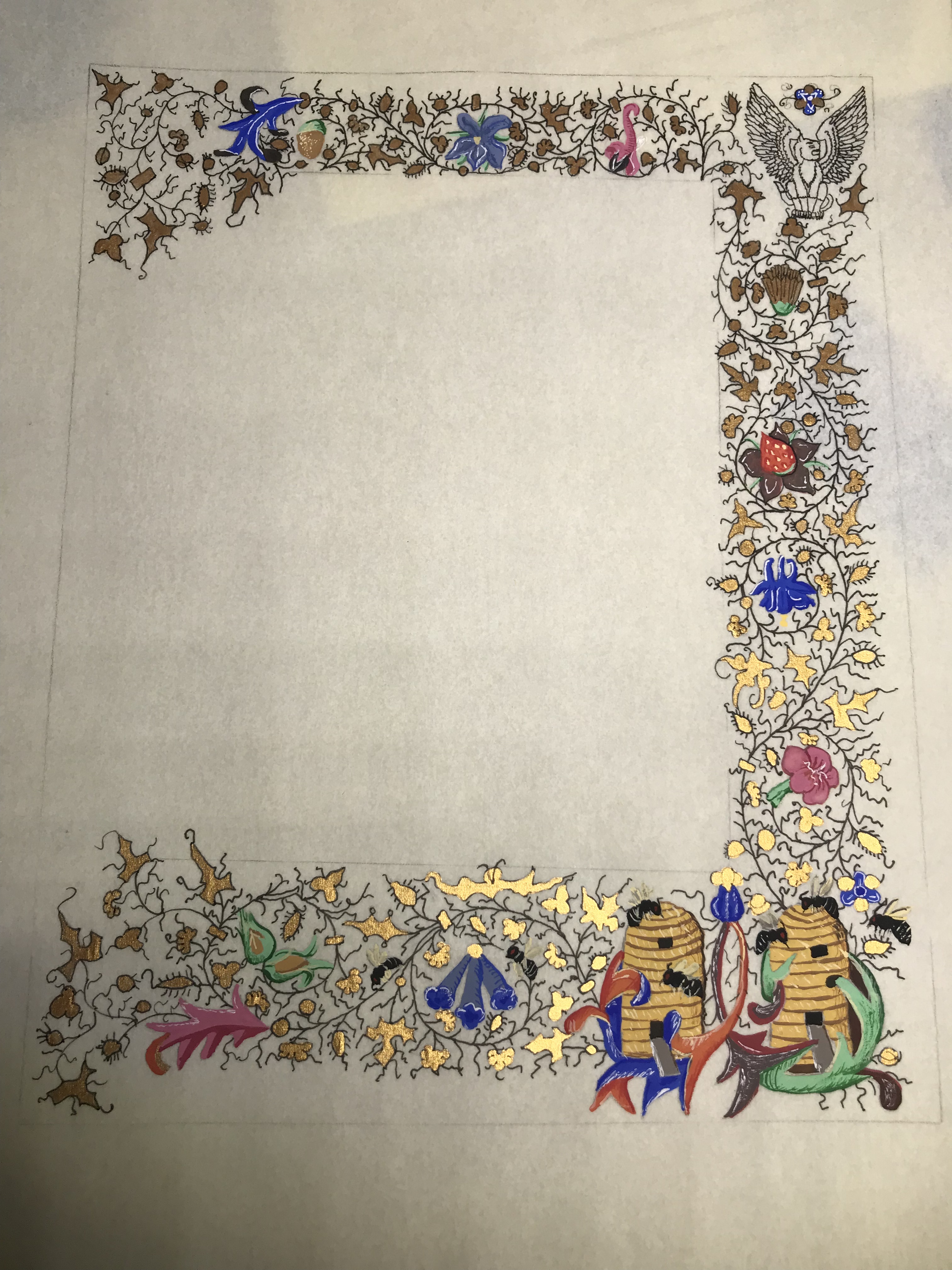
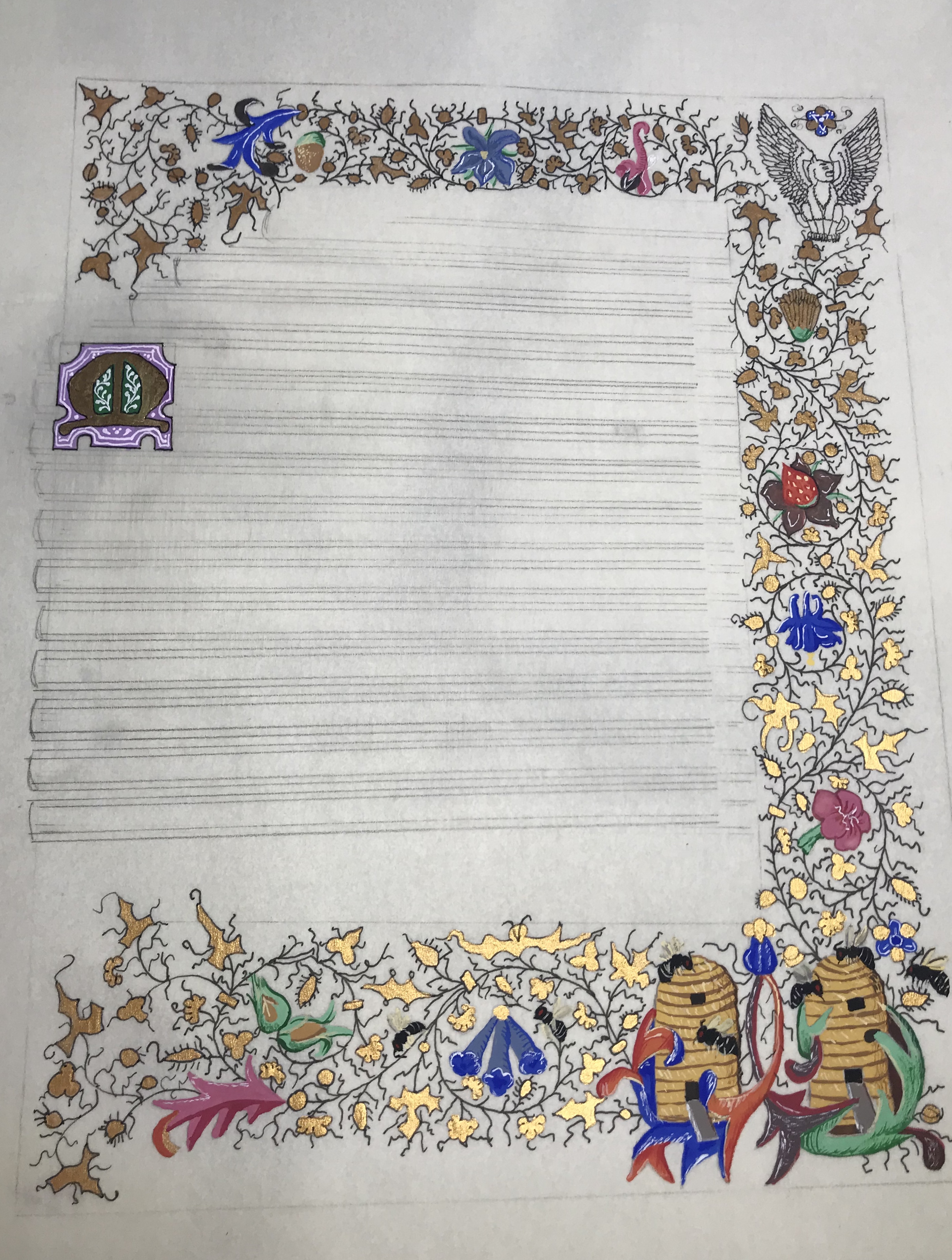
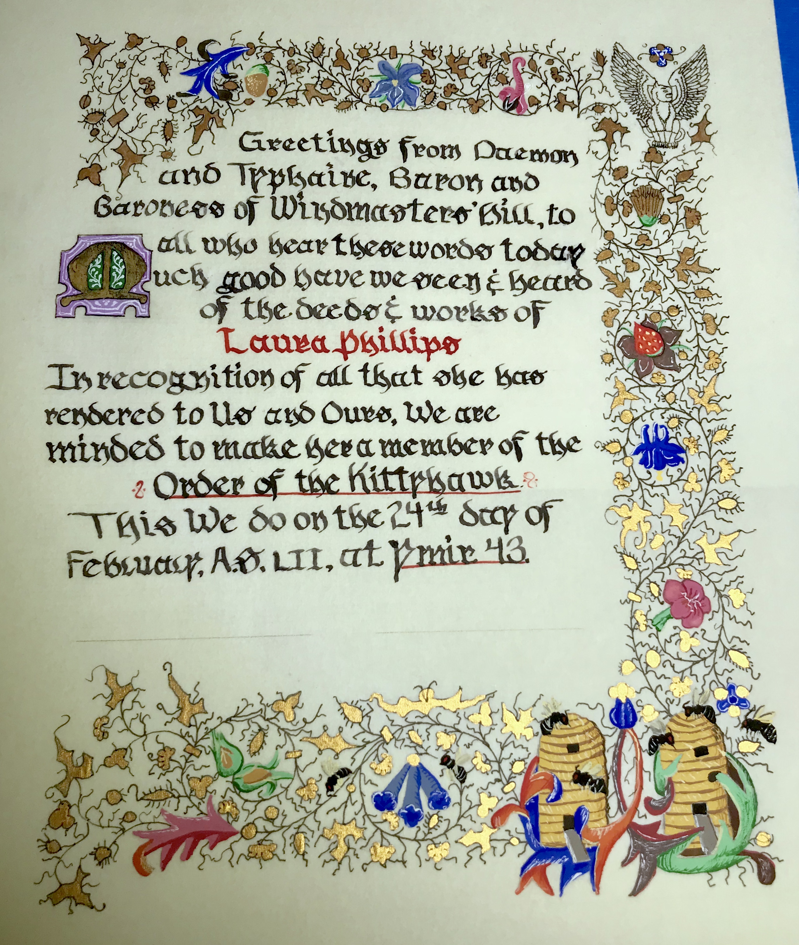
My next scroll was a Baronial award for the Kittyhawk for someone in my Canton whom I didn’t know as well as a do now but who was and is still an amazingly lovely and graceful person. She gives her all and does so with kindness. I had to sneak a bit to find out some of her likes (bees, purple, green, etc.) and then looked to exemplars. Bees are not an overly common theme, and where they are is usually as part of a bestiary or they are attacking which is not anything like her. I found my influence in The Hours of Catherine of Cleves.
The Hours of Catherine of Cleves, Birthof the Virgin, MS M.917/945, p. 144-f.20r. Netherlands, Utrecht.
The calligraphy hand was interesting and I really wanted to stay true to the exemplar. As I stated previously, I’m not as fond of calligraphy as I am painting. I also hadn’t had any guidance up to this point either…it’s rather vague from books and online sources. It wasn’t until I actually had the chance to WATCH someone form letters and hear the nib move and Skitch that it clicked. This was Fraktur (aka Fractur), a Germanic hand. I was still trying to write large letters here, which wasn’t comfortable…hard to explain, but similar to someone trying to write as neatly as possible on a billboard. The strokes felt ungainly and were difficult. Later realization was that I normally write small, and that is where my comfort zone is.
Practicing a new hand, discovering that smaller looked better (still not in my comfort zone) and asking advice of my Laurel.
I have not yet had the epiphany that you do the writing FIRST and THEN you devote hours to drawing. This came home to me, painfully so, in this scroll. I was also not adept at “erasing” errors, which as time has progressed, I am becoming better at doing (much to my chagrin).
This is a progression with lessons in shading, detailing and highlighting. I found that I had to extend the bottom left a bit farther than my exemplar, but feel I did well blending it. I also wanted the award to be “not-so-obvious” and rather than plopping it at the bottom, I placed it in the border. I stayed true to the award’s design, just black ink, but retrospect has me wondering about making it blend more with the border. I suspect that I wasn’t so brave at this juncture to change much. I copied the capital from another page, just changing colors to the receipient’s favorites. I filled in the words, smeared a bit and corrected, which, I admit, made me quite low. Here I had spent a ton of time with the border only to make a stupid mistake on the lettering. HUGE lightbulb moment!
Her award. I tried straightening the photograph…it makes the lines of text look wonky. I think I just need to take better photos!
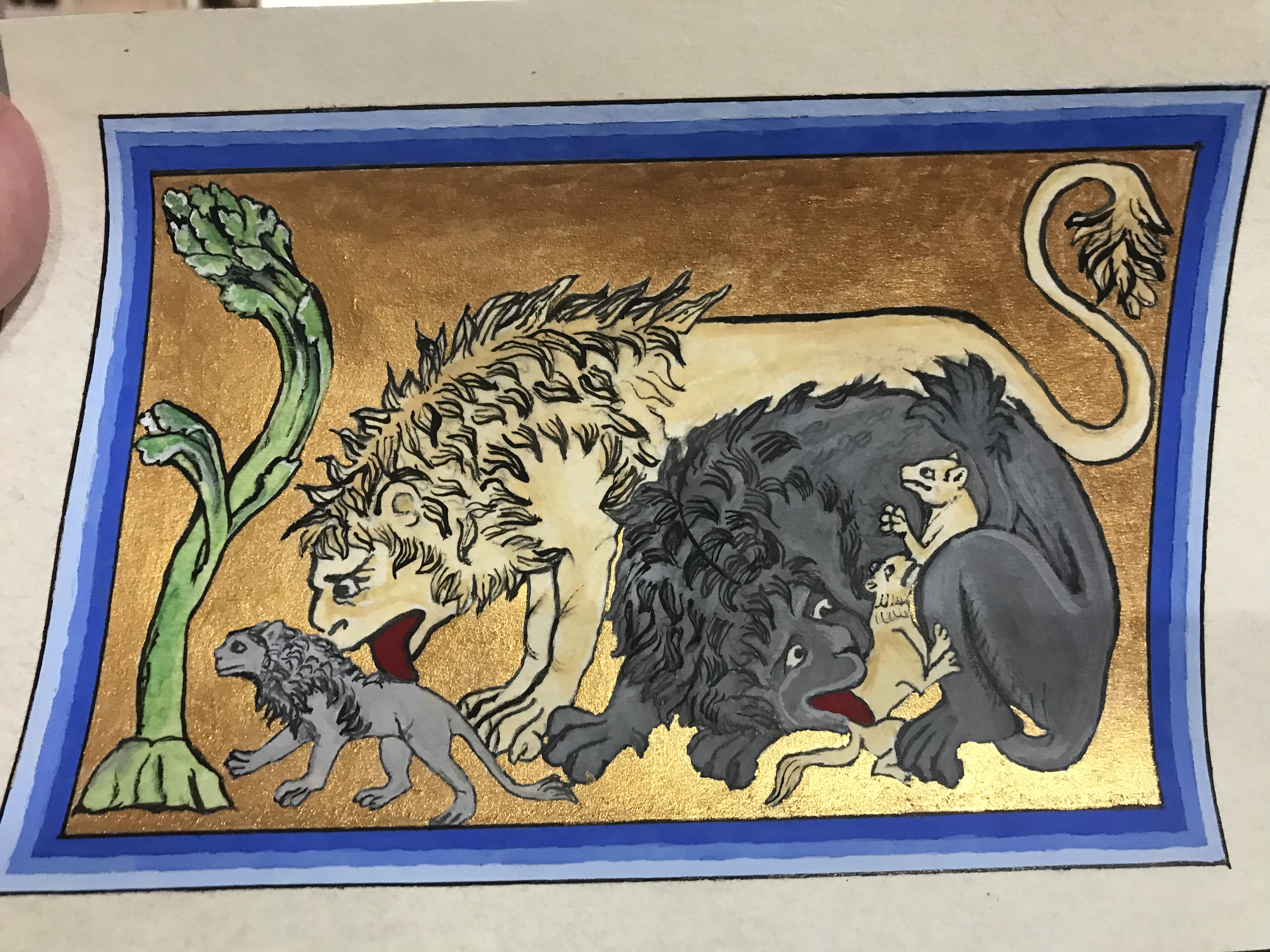
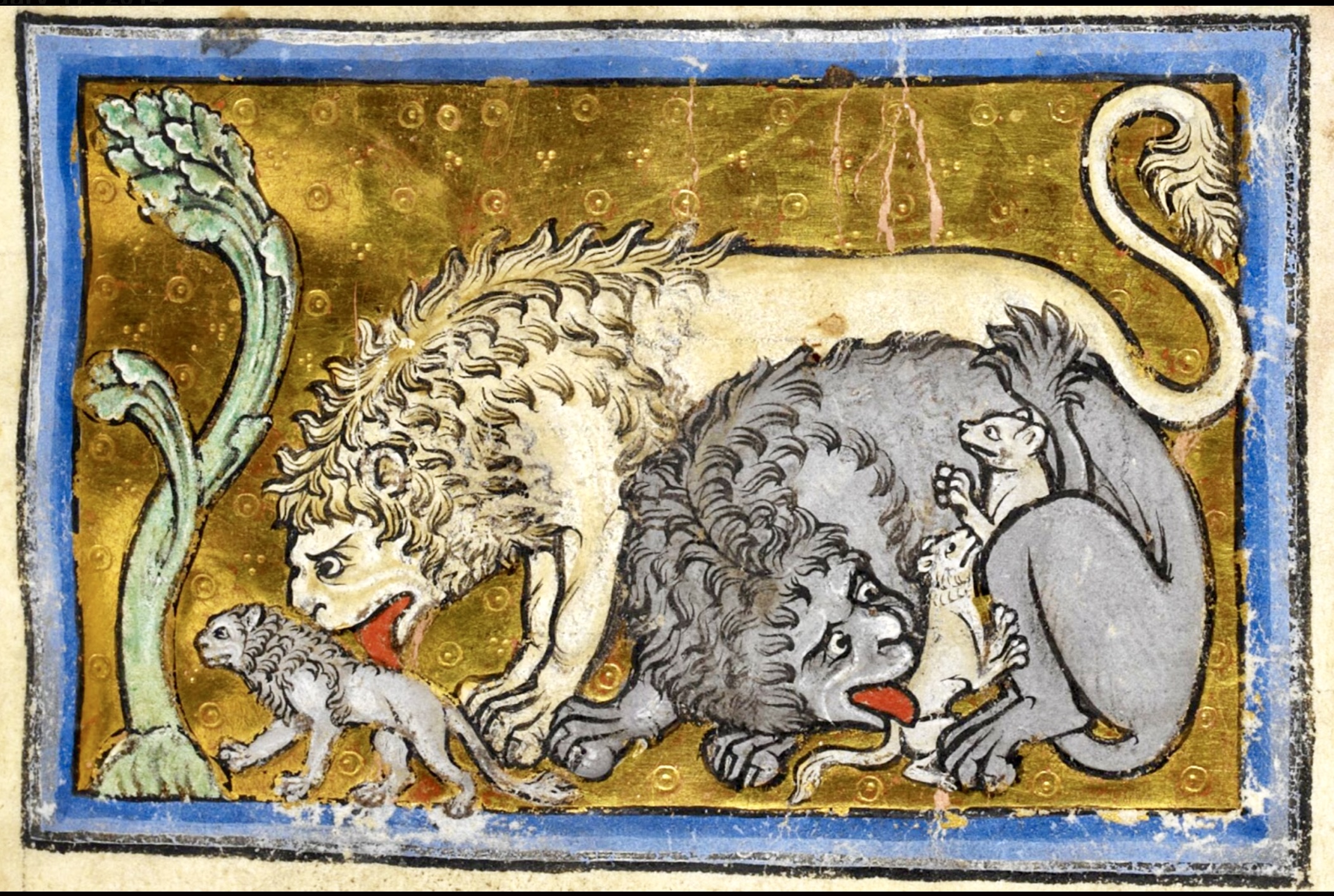
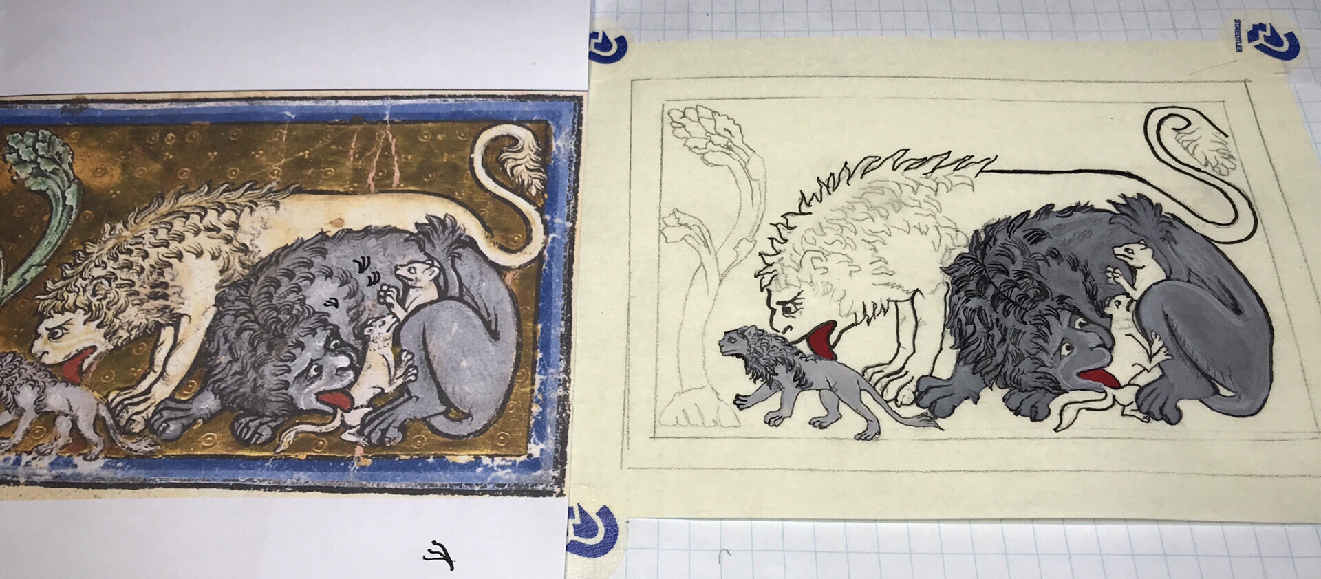
As I noted in previous posts, I was encouraged by my Laurel to “start small” and create items that have meaning to me or to a recipient who is known to me. I love the bestiary books…the thought of scribes drawing beasts — some mythical; some real — to provide allegories for the populace. (Too, I am amused by some pictures where you can just tell that the poor illustrator has NO idea what this animal is supposed to look like, and they are going off of a description provided by someone fairly inept at providing any kind of accurate description.)
Before framing…gouache on pergamenata, mica gold. Source: Bestiary, Royal 12c. xix, British, about 1200-1210.
The following are progression photos…how I created it with the exemplar adjacent…
It was this with this effort that I realized that gold mica paint is fine, but I wanted to be able to create those little circles and dots from the original…which could be done with gilding by making impressions on the substrate under the gold to create a 3-D pattern. I had taken a class at Pennsic on gilding at a vendor’s booth. It was one of the hottest years that most folks could recall (my first), and humid. Needless to say, it was frustrating and seemed amazingly fussy and time-consuming for the poor effort that we got. Looking back, it could not have been done under much poorer trying conditions for this than if Titivillus himself had created it. Not that this is simple to do, but this seemed impossible, which is why I looked to other methods for my gold bling.
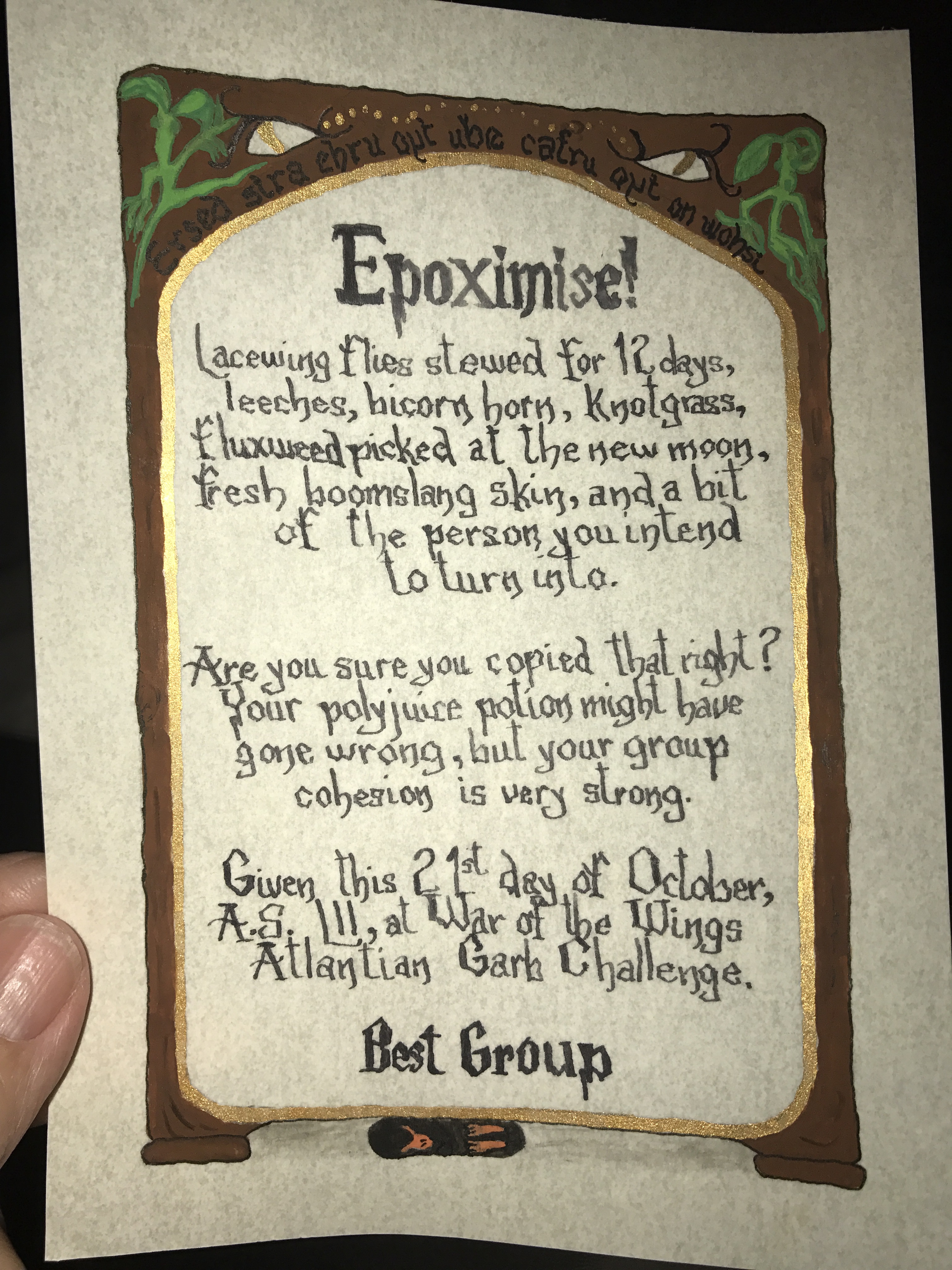
As a natural progression, I had to, at some point, make a scroll that would be given out. While the first was not really period, it was a challenge unto itself as I was asked to make scrolls for an award for a contest. The scrolls were for “Best Group” and she asked me to make three of exactly the same award…um, gulp? The theme was Potterverse, including Fantastic Beasts, and so I drew bits from both series. The hardest part? The hand. Wishing to emulate the famous Potter script was difficult as it was more of drawing the design rather than shaping a letter. And the words, created as a spell by the person who held the contest were hard to get into the space. (The photo I have is a bit skewed as the paper was curved. It makes the words seem even more crooked than intended.). Challenge accepted.
Gouache on pergamenata, mica gold paint, Micron pens for outlining. Dip pen and ink for writing. This is the mirror at Hogwarts with its famous backwards quote at the top, the design from F.B. Book cover above that, little bowtruckles at the upper corners, and an innocent snoozing niffler in the shadows under the mirror.
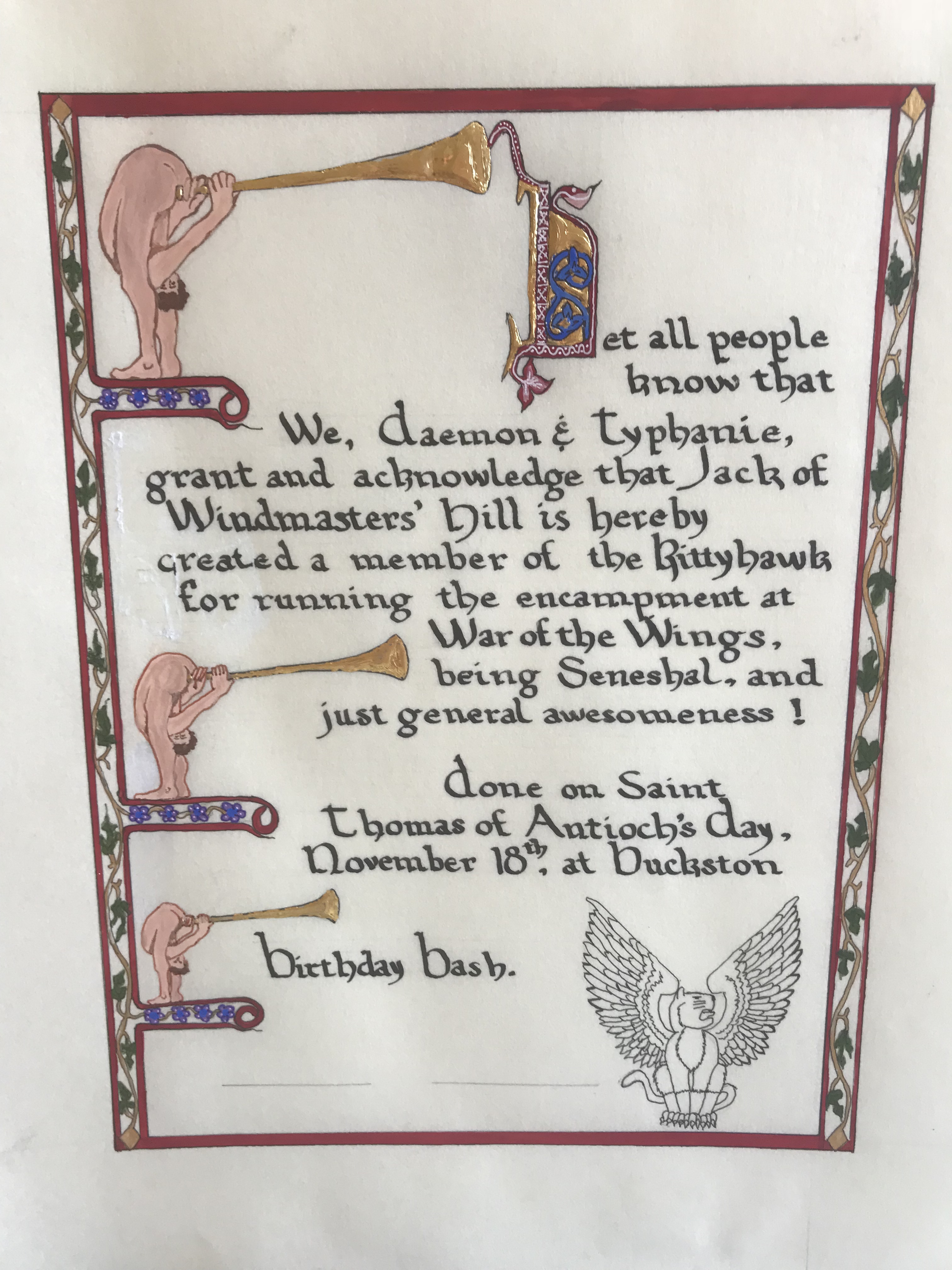
The next two awards followed my Laurel’s recommendation to do awards “locally” for the barony, and personally for your family. Neither knew they were being recognized and doing these scrolls in the same house was a challenge, to say the least. Having to hide and cover while you are painting is NOT a joy. However, seeing their faces totally made up for it!
The first was for my husband. Taking the personalization to heart, this was all for him. I used the image of Monty Python’s trumpeters (from the opening of the show) and used them as my left border. The initial was from a real exemplar…my first! I felt that it fit well with the trumpets. In this too was my first use of “invisible” ink (which is totally period as I later discovered) and it is black light responsive. What I drew with it, however, is not, it is Boba Fett’s helmet. It has meaning for my husband, and it was an “Easter egg” for just him to know about. My Laurel helped me with this one…she did my gold work, using rabbit glue and gold — shiny and SUCH a difference from the mica! I did things a bit backward, doing the illumination first and then my calligraphy. You can see where I ended up scratching up the surface of the pergamenata with my pen containing the invisible ink….I didn’t think it was going on, then it pooled…then, well, I left well enough alone as the gold was already down and I was in a bit of a time crunch.
My first “real” award scroll, period trumpets and all. Gouache on pergamenata, gilding with rabbit glue and gold leaf, Micron pen for the Kittyhawk, and dip pen with Noodler’s Eternal Darkness ink.
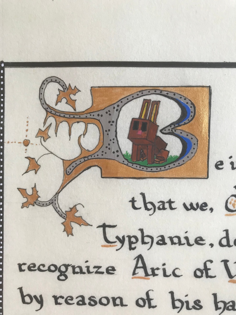
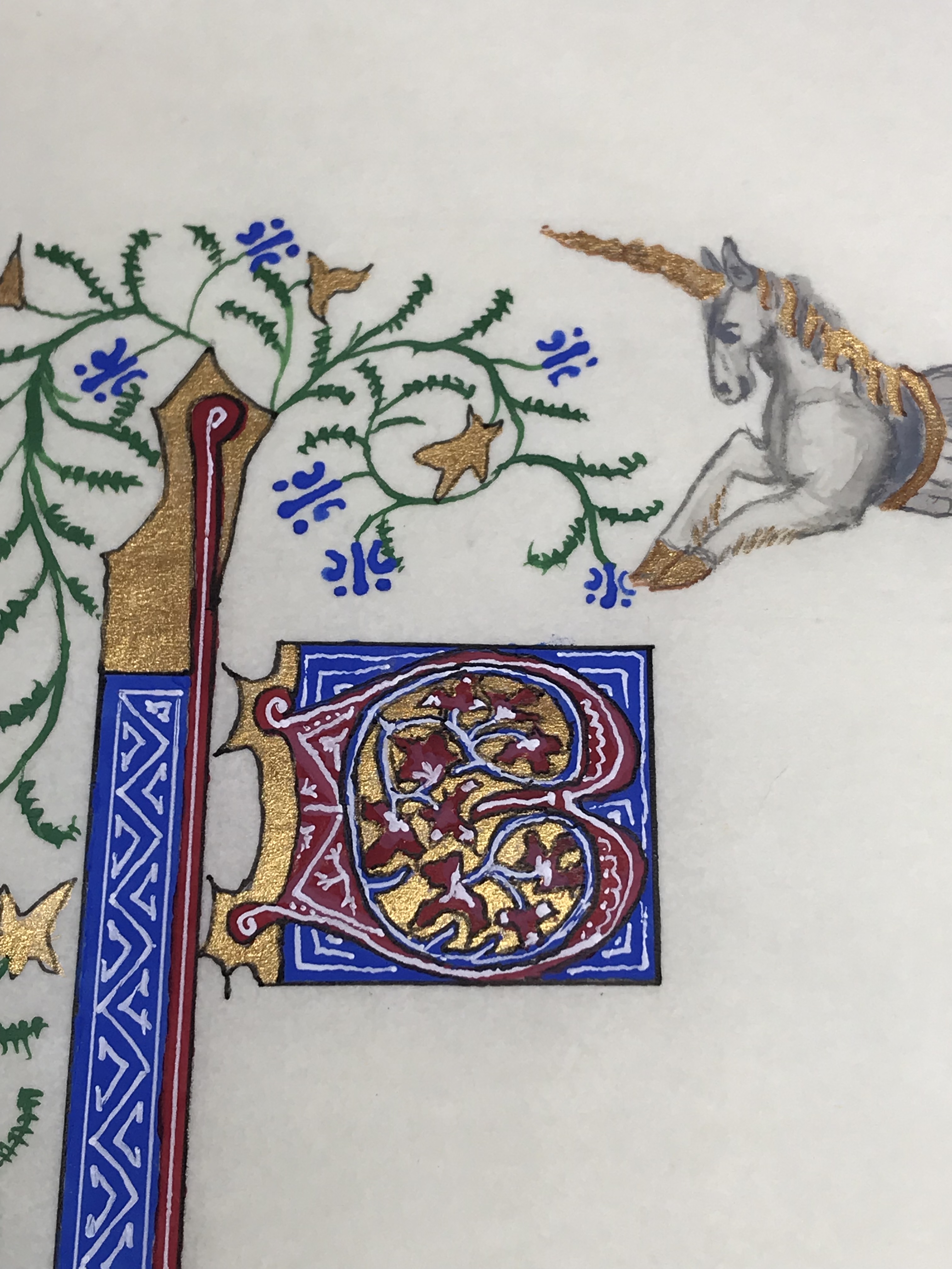
The second was for my son, a Baronial award to be given at the same event. There was a blank that our Chancery had for this award…and while quite detailed…it had Sponge Bob characters across the bottom. Not anywhere near my son’s interest! I felt I could do better for his first award, I just knew it! He is a BIG Minecraft fan, and he had just been given our rescued kitten. I found this:
Detail from a Book of Hours, Harley MS 6563, f. 72r
…and it all fell together. I replaced the boulders with Minecraft blocks, colored the cat more closely to his new kitten, and for the initial, created a Minecraft bunny inside the letter “B”, the shape of which was from an exemplar with a bear.
Gouache on pergamenata, Noodler’s ink. Some issues with the gouache…I suspect now that I may have been too heavy with the gum Arabic.Close up of the bunny, taken from a photograph of a plastic toy. I wish I had gilded this instead of using gold paint….would have been amazing!
This next is my first “gift” – a blank card to be given as a thank-you for a friend who received a gift from the Queen. She is a twin, a warrior and a Viking persona. Her colors are the blue and white that I used for the card. Her heraldry is a rabbit facing a crescent moon (opposite her twin’s). The design of the left border is from a stone….it looks uneven and rough, because the stone was and I wanted to keep that feel…though anyone not knowing the source might think it just sloppy. Hindsight. I took a photo of a period brooch and turned it into the bunny at the bottom. The “words” are a transliteration of Viking runes, as nobody really knows the language and how it was used – the things you learn! It is a fun personalized descriptive of the Queen. As a side note, I saw her post on Facebook about it….she was thrilled and this was my first feedback from a recipient…..what a rush!
The thank-you blank with my “influences” to the left. Done on pergemenata with gouache. Outlined with Micron pens. The left detail is from the stone Gosforth Cross, St. Mary’s….10th century Viking. The rabbit is taken from a Celtic British brooch about 8 AD, and the words are a transliteration of Viking Runes as “Sinister Wonder Bunny” a reference to the recipient’s left handedness (vs her twin) and a nickname that was given to her a long time ago.
This brings out a big point for me, and one which I try to follow… I am a FIRM believer in personalization — making a scroll pertinent to the recipient’s interests/persona/likes/story. It has to be MORE than just pretty; I want them to recognize the personal touches to know that THIS was specifically made for THEM. It can be subtle or blatant, as the occasion warrants, but personalized is my ambition.
Following this, I wanted to try my first “real blank, working from an exemplar. I found that I needed to extend the base a bit and so I attempted to mimic the style of the original. I do feel that it fit fairly well. This was a pattern that I was drawn to in Catherine of Cleeve’s book…it was different, it was strange, and I loved the flowers and leaf shape. This was really also a first attempt at trying to understand HOW the original was painted…which colors were placed down first, what technique was used to highlight, etc. I was not happy with making the lines, frustrated in trying to duplicate the smoothness and continuity of the original. The leading initial “B” leaves much to be desired. This was still me working on emulating styles rather than picking an exemplar. It is flat, and rather plain.
Gouache on pergemenata, gold mica paint.
Exemplar: Hours of Catherine of Cleese’s, Netherlands, ca. 1440.
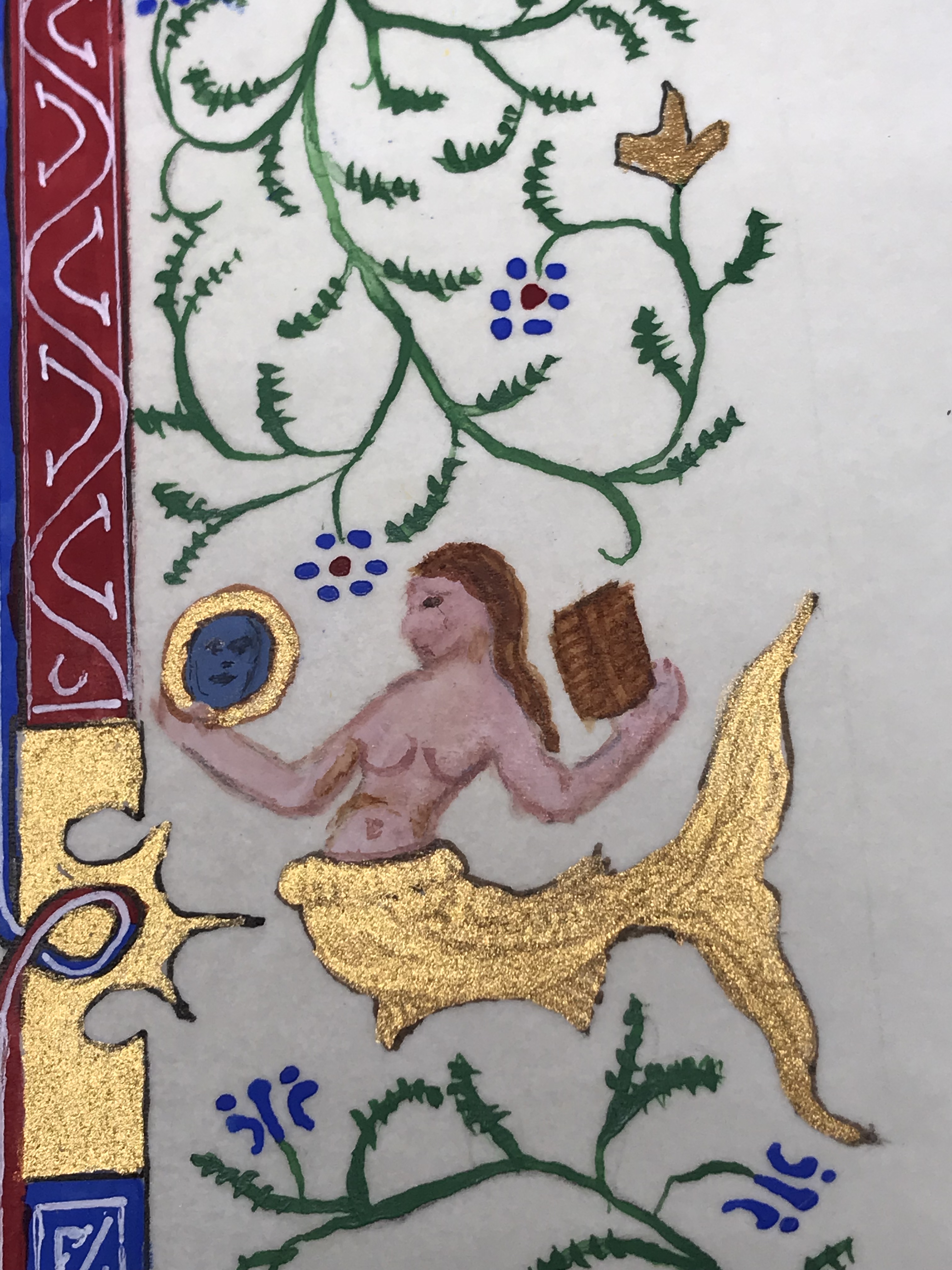
From this I felt brave enough to do another blank. This one was more of a challenge and I wanted to create a theme. Using some artistic license, I took merfolk from different pages and combined them. I also pulled a seahorse from a different source, and since Atlantia’s symbol is Spike, a horned seahorse, I added a horn. The challenges were shading…clothing on the Knight, the face (and ESPECIALLY reflection) of the mermaid, and Spike’s musculature and face. This was my first attempt at geometric patterns….the white work took a bit of thought. Still with an ink pen, I had tried a crow quill, but couldn’t get it to flow (not knowing how to prep it) and I didn’t own a nice enough brush to create delicate white lines. You can see the progression from my rather plain “B” capital in the first blank to this one…
Gouache, archival white ink, Gold mica paint, Micron pen.
Exemplars:
1. Merhorse (modified) from 13c De Natura Rerum by St. Alberta’s Magnus.
2. Multiple pages, Book of Hours, Paris France, approx. 1410, Follower of the Egerton Master.
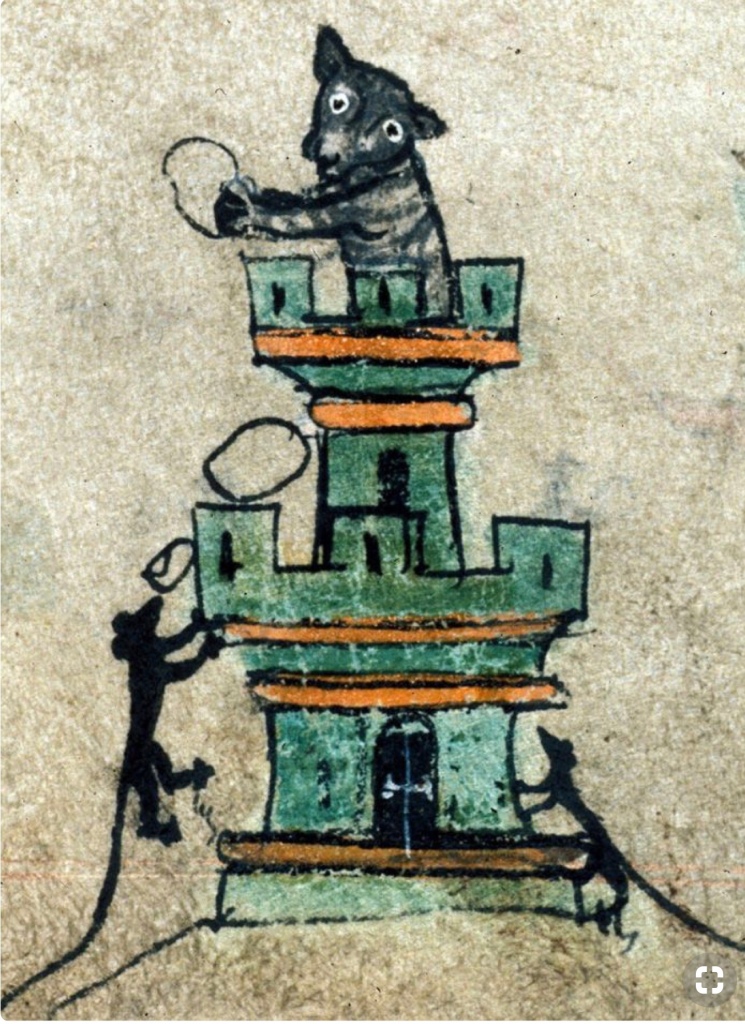
Bunny Love….gouache on pergamenata, outlines Micron pens. Source: Pontifical of Guillaume Durand, Avignon, before 1390. Paris, Bibliothèque Saint Geneviève, MS 143, fol. 165r.
The first was a marginalia, I fell in love with the “insane bunnies” (my term) from the margins of books created so long ago. This was just for me, to prove to myself that I could do it. I really had no idea of technique, shading, blending, or how the original was created. And yet, it is a favorite – my first baby.
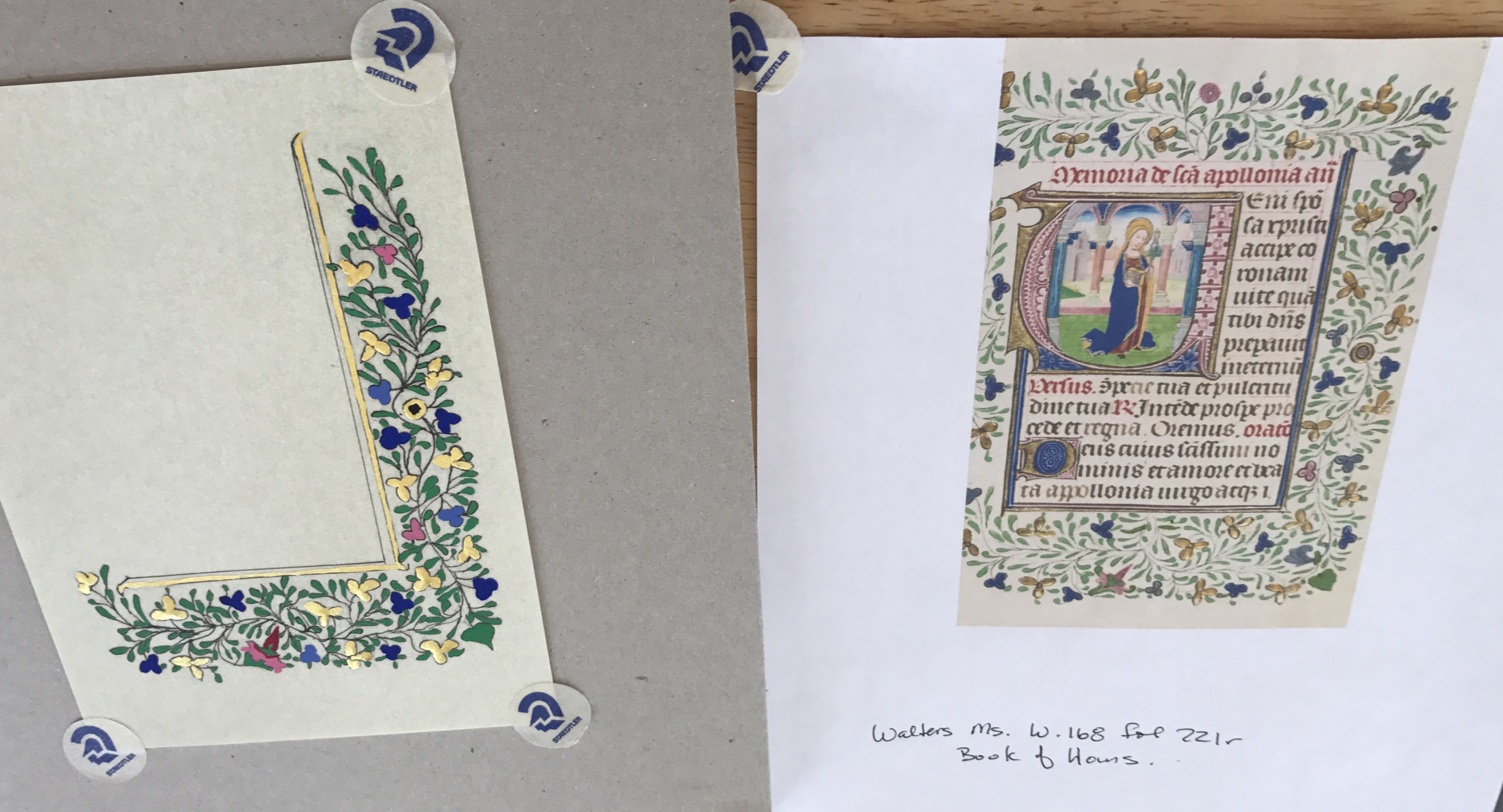
Border…gouache on pergamenata, mica gold paint, on outlines. Source: Walters MS W.168, fol. 221r, Book of Hours.
This border was made for my first meeting at the request of my (now) laurel, Baroness Michel Almond de Champagne, OL, OP to see where I was starting. It is messy and sloppy, lines are uneven, no shading and no clue on paint. Yet, it was a start, proof to myself that I could take an extant examplar and create a passable copy that could be useful. More, it is a reminder of how my SCA world opened up that day and I was strongly encouraged to do more and better. Learning techniques and, my first lesson: use the best tools that you can obtain/afford and use the proper tools right from the start (why use acrylics when they didn’t exist?).
This is my first attempt at a hand. I was a bit dismayed to realize that I was expected to be able to do the calligraphy as well as make pretty pictures…my brain finds this to be much more difficult. I figured this would be good practice, using a nib pen for the first time, and creating a “fancy” initial. At the time, I felt it was quite spiffy! Obviously, the ink smears, letter spacing and letter height are the marks of someone who has no idea, but it was a start!